Jump to content


Hierarchy of Hell


45 replies to this topic

#1 General

    Insufficient Title

  • Member Test
  • 3869 posts

Posted 13 April 2009 - 14:42

Posted Image

This is a new project I am starting now, which I decided long time ago.

This thread will only contain the concept arts related to creatures of hell realms, I'll design the creatures according to the images I've seen from old paintings and scriptures, such as Dante's Inferno and various religious scriptures aswell, some images entirely would be my own design, some of them will be inspired from old scriptures about demons' anatomy.

And I will give a small amount of information about demons, most of them would be make up by myself, but I will copy some informations from wikipedia or such aswell :read:

So I hope you look forward to it and add your comments and critiques 8|

#2 Camille

    girl eater

  • Project Team
  • 2351 posts

Posted 13 April 2009 - 14:58

sounds very interesting man, definitely something i'd do if i weren't such a lazy git :read:
it's time to wake up

#3 Dauth

    <Custom title available>

  • Gold Member
  • 11193 posts

Posted 13 April 2009 - 15:16

Daemonic mythology, it has peaked my interest, I'd like to see what you can come up with.

#4 Overdose

    Nice Guy Syndrome

  • Gold Member
  • 4146 posts
  • Projects: SWR Projects

Posted 13 April 2009 - 15:24

This has actually inspired me to write something.
Posted Image

#5 Ghostrider

    Duly Appointed Federal Marshal

  • Project Team
  • 991 posts
  • Projects: The Pants Party, Irradiated Inc.

Posted 13 April 2009 - 15:53

Hmm, maybe include the various forms of torture they perform on the people in each layer? This concept has always interested me. :read:
Posted Image
AJ is responsible for this signature masterpiece... if you see him, tell him I say thanks.
Posted Image

#6 Ion Cannon!

    Mountain Maniac

  • Gold Member
  • 5812 posts
  • Projects: European Conflict - Particle FX & Coder

Posted 13 April 2009 - 16:33

Sounds very interesting, I shall definately be following this. Now all they need to do is release D3.
Posted Image

Posted Image

#7 General

    Insufficient Title

  • Member Test
  • 3869 posts

Posted 13 April 2009 - 16:33

 Ghostrider, on 13 Apr 2009, 17:53, said:

Hmm, maybe include the various forms of torture they perform on the people in each layer? This concept has always interested me. 8|


I actually wanted to do it, but if only admins here allow it, I may post them :read: as it would be a bit too extreme !

#8 Sgt. Nuker

    Greenskin Inside

  • Global Moderator
  • 13457 posts
  • Projects: Shoot. Chop. Smash. Stomp.

Posted 13 April 2009 - 22:30

Seven circles does Hell have, the lowest of which, is reserved for betrayers and mutineers.
Posted Image

#9 Wizard

    [...beep...]

  • Administrator
  • 9627 posts

Posted 14 April 2009 - 09:10

 General, on 13 Apr 2009, 17:33, said:

 Ghostrider, on 13 Apr 2009, 17:53, said:

Hmm, maybe include the various forms of torture they perform on the people in each layer? This concept has always interested me. 8|


I actually wanted to do it, but if only admins here allow it, I may post them :read: as it would be a bit too extreme !

Feel free to run it past us via PM or MSN if you'd like General. Sure none of us would mind.

Looking forward to seeing this.

#10 General

    Insufficient Title

  • Member Test
  • 3869 posts

Posted 14 April 2009 - 13:19

Ok I will 8| 
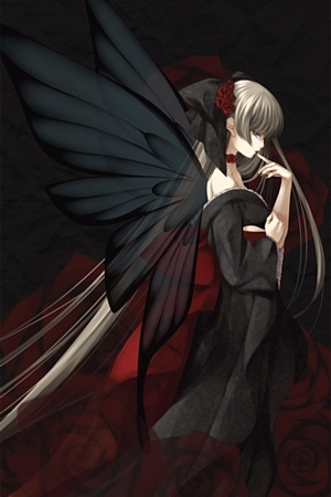
Here is the first update, critiques are most welcome since it is the first one :read:

Posted Image

Edited by General, 16 April 2009 - 16:27.


#11 Wizard

    [...beep...]

  • Administrator
  • 9627 posts

Posted 14 April 2009 - 13:26

Dear God that is well drawn!

#12 Mathias

    we dont need i to c

  • Member
  • 3831 posts

Posted 14 April 2009 - 14:21

I love the quaint splash image you made. While you did mirror that drawing of the Lord of Flies, it's well done. I especially like how well you integrated his face with the body of the fly.
Lifes a shit.. deal w/ it..its impossible to have a good day wow fuck this gay earth much??
Posted Image
Ask me questions about audio technical matters or DAWs!

#13 General

    Insufficient Title

  • Member Test
  • 3869 posts

Posted 15 April 2009 - 17:45

 Wizard, on 14 Apr 2009, 15:26, said:

Dear God that is well drawn!


Thanks :duh:

 Mathias, on 14 Apr 2009, 16:21, said:

I love the quaint splash image you made. While you did mirror that drawing of the Lord of Flies, it's well done. I especially like how well you integrated his face with the body of the fly.


Thanks and yes, its a mirror, I didn't explain anything about it since it is too obvious :duh: I just draw the half of it and Photoshop do the rest :D

And here second dude :

Posted Image

I think I need to think something better about these fonts...

Edited by General, 15 April 2009 - 17:47.


#14 Alias

    Member Title Goes Here

  • Member
  • 11705 posts

Posted 15 April 2009 - 23:42

Absolutely brilliant drawing wise, as always, General. :D
You do need a little bit of work on the formatting and layout though.

Edited by Alias, 15 April 2009 - 23:42.


Posted Image

#15 Dauth

    <Custom title available>

  • Gold Member
  • 11193 posts

Posted 16 April 2009 - 07:29

Put the text in newspaper format and have another look at it, it might look better. Also since you're discussing daemons how about you try using a different font, something ancient and partially difficult to read. It will add tone.

#16 SorataZ

    Professional

  • Member
  • 347 posts
  • Projects: For the hunt I sharpen my claws.

Posted 16 April 2009 - 07:48

Posted Image :sly:

#17 General

    Insufficient Title

  • Member Test
  • 3869 posts

Posted 16 April 2009 - 10:40

That one looks difficult to read but good :sly: I'll definately do something different on next one :)

#18 SorataZ

    Professional

  • Member
  • 347 posts
  • Projects: For the hunt I sharpen my claws.

Posted 16 April 2009 - 11:13

Very good decision :sly: Actually, I like Old English, it is a very nice style and although it is a bit complicated, it is not impossible to read.

#19 Alias

    Member Title Goes Here

  • Member
  • 11705 posts

Posted 16 April 2009 - 11:18

Blackletter fonts are too cluttered for main body text.

Use Garamond, Helvetica (hurrr, hell) or something similar for the body, the blackletter is fine for headings.

Posted Image

#20 General

    Insufficient Title

  • Member Test
  • 3869 posts

Posted 16 April 2009 - 16:27

I updated ( edited ) the Baalzebub one, if it looks good or not let me know :) ( Parchment found randomly on web :sly: )

#21 BeefJeRKy

    Formerly known as Scopejim

  • Gold Member
  • 5114 posts
  • Projects: Life

Posted 16 April 2009 - 17:07

A gothic font might be good.
Posted Image

#22 SorataZ

    Professional

  • Member
  • 347 posts
  • Projects: For the hunt I sharpen my claws.

Posted 16 April 2009 - 17:10

Question: Why are those demons you post so ugly (no offense, but they really are)?

#23 General

    Insufficient Title

  • Member Test
  • 3869 posts

Posted 16 April 2009 - 17:41

 KamuiK, on 16 Apr 2009, 18:10, said:

Question: Why are those demons you post so ugly (no offense, but they really are)?


Because thats the point of it :sly: Both creature I draw ' have to be ugly ' , one is damned because he was boasting around with his beauty and told humans are ugly and another one ' intentionally created ' as ugly to give even worse terror and pain to his slaves in his realm ;)

Though I guarantee you, you will see ' cool looking ' ones aswell in time, not only random fleshes :) Story is too important in this project.

Also these all will be just a bit detailed sketches, if I decided to come up with fully completed piece of every creature, my lifespan will not be enough for that :) and my skills not enough to give much time aswell, in this project,I will both learn and attempt to create a project in my mind.

Edited by General, 16 April 2009 - 17:45.


#24 BeefJeRKy

    Formerly known as Scopejim

  • Gold Member
  • 5114 posts
  • Projects: Life

Posted 16 April 2009 - 17:52

 KamuiK, on 16 Apr 2009, 13:10, said:

Question: Why are those demons you post so ugly (no offense, but they really are)?

I don't know about you, but I've never pictured demons as looking sleek or pretty.
Posted Image

#25 SorataZ

    Professional

  • Member
  • 347 posts
  • Projects: For the hunt I sharpen my claws.

Posted 16 April 2009 - 17:52

Sure go, but I prefer demons (ok, a demonic fairy aka Pixie here) if they are like this: :sly:
Posted Image
Sponsored by MysTech and :)

Edited by KamuiK, 16 April 2009 - 17:58.


1 user(s) are reading this topic

0 members, 1 guests, 0 anonymous users