Jump to content


Bob's media corner


654 replies to this topic

#601 TheDR

    Whispery Wizard

  • Administrator
  • 5852 posts

Posted 08 October 2008 - 22:27

View PostWizard, on 8 Oct 2008, 23:24, said:

I am gonna take a stab at guessing a gradient map. Possibly a photo filter, but my money is on a gradient map. Orange to transparent with a layer effect of potentially luminosity or screen, can't make my mind up.

Hey, a new PS game, what did I do here? Sounds like fun.

PS although in fairness it could just be some brush strokes with a colouration :rotfl:


It looks like a GM to me as well and if your going to make that game il play.
Posted Image
F O R T H E N S
Posted Image

#602 Wizard

    [...beep...]

  • Administrator
  • 9627 posts

Posted 08 October 2008 - 23:11

View PostThe Dr, on 8 Oct 2008, 23:27, said:

It looks like a GM to me as well and if your going to make that game il play.


That's what I thought but he must've blacked brush some as it isn't totally mapped across the whole image.

Ok will set something up

#603 Slightly Wonky Robob

    Not a Wonky Gent.

  • Administrator
  • 9337 posts

Posted 08 October 2008 - 23:48

Gradient map Orange to Blue.
Posted Image
F O R T H E N S
Posted Image

#604 Slightly Wonky Robob

    Not a Wonky Gent.

  • Administrator
  • 9337 posts

Posted 20 October 2008 - 14:39

A couple of WipEout HD sigs. I think the second one turned out better than the first :D

Posted Image

Posted Image
Posted Image
F O R T H E N S
Posted Image

#605 Futschki

    Duh!

  • Member
  • 2835 posts

Posted 20 October 2008 - 15:08

yeah .. the Second is pure awesomeness ... in the first one the part that pops out looks not cut out so well ... and that black line under the front (the blurred one) looks so weird .. ...
Posted Image

#606 Warbz

    IRC is just a multiplayer notepad.

  • Project Team
  • 4646 posts

Posted 21 October 2008 - 10:05

Fade effect on the first one is a bit, uhm... distracting? But, the second one I like. :cool:

Posted Image

#607 Mbob61

    I may or may not be iron man!

  • Project Team
  • 3068 posts
  • Projects: European Conflict

Posted 21 October 2008 - 15:38

View PostEpicWarbz, on 21 Oct 2008, 11:05, said:

Fade effect on the first one is a bit, uhm... distracting? But, the second one I like. :cool:


I totally agree. I find my eyes get drawn towards the faded area.
The second one is great like everyone has said.

Mike
Thanks to Pav3d for the awesome sigs
Posted Image
Posted Image

#608 Slightly Wonky Robob

    Not a Wonky Gent.

  • Administrator
  • 9337 posts

Posted 25 October 2008 - 16:15

So I updated my SotW entry... but got distracted playing Shw, and forgot to enter it... by the time I remembered it was too late >_<

Here it is, anyway:

Posted Image
Posted Image
F O R T H E N S
Posted Image

#609 Warbz

    IRC is just a multiplayer notepad.

  • Project Team
  • 4646 posts

Posted 25 October 2008 - 16:35

If I hadn't seen the original render I would have said wtf is the dark thing on the left. But the same issue @ all of 'em really.

Posted Image

#610 Ellipsis

    <Custom title available>

  • Member
  • 806 posts
  • Projects: Co-Leader of Zero Hour:Unleashed

Posted 25 October 2008 - 16:48

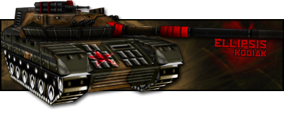
I am guessing its a gun. =/
Posted Image
Thanks for the sig and avatar, 'Dr.

#611 Slightly Wonky Robob

    Not a Wonky Gent.

  • Administrator
  • 9337 posts

Posted 21 November 2008 - 21:13

Sotw entry:

Posted Image

Again, tried to do something different... tried to make it look like it had laser'd it's way through the forth wall... don't think I quite achieve it though Posted Image
Posted Image
F O R T H E N S
Posted Image

#612 Brad

    Quick! STAB YOURSELF FOR SAFETY!

  • Member Test
  • 1467 posts

Posted 21 November 2008 - 21:16

..Wall?

I like it, it looks like it had just come from a portal of some kind (the render), the blur effect completes that I believe, however, I believe that the render behind the 'pop out' looks distorted, although it may have been intentional.

Edited for clearity

Edited by Tactical_person, 21 November 2008 - 21:17.

You almost did, didn't you?

#613 Slightly Wonky Robob

    Not a Wonky Gent.

  • Administrator
  • 9337 posts

Posted 21 November 2008 - 21:19

Fourth Wall

But what you described is pretty similar to what I had in mind. And it was intentional... it was the original with a flipped version of this overlayed.
Posted Image
F O R T H E N S
Posted Image

#614 Slightly Wonky Robob

    Not a Wonky Gent.

  • Administrator
  • 9337 posts

Posted 12 February 2009 - 21:48

My latest sig:

Posted Image

Edited by Bob, 12 February 2009 - 22:18.

Posted Image
F O R T H E N S
Posted Image

#615 Wizard

    [...beep...]

  • Administrator
  • 9627 posts

Posted 13 February 2009 - 11:43

Nice work Bob. A great sig. Only possible criticism is that the swords scabbard [do kitanas have scabbards?] ends up obscuring the face of the faded render. Great work otherwise. It's never easy to make good AS sigs as the character is a scrawny sod by nature and never really fills the space.

#616 Slightly Wonky Robob

    Not a Wonky Gent.

  • Administrator
  • 9337 posts

Posted 20 November 2010 - 20:35

Wow... it has been a while. D;

I've been reading up on TF2 (as I haven't a clue what 90% of the game is about :P), and I found out how to make sprays... So yeah...Thought I'd show of my first ever spray. :P

Posted Image

Thoughts?

Posted Image
F O R T H E N S
Posted Image

#617 TheDR

    Whispery Wizard

  • Administrator
  • 5852 posts

Posted 20 November 2010 - 21:08

Nice, it fits the Tf2 style and i really like the fold marks.

Welcome back to the world of art Bob :P
Posted Image
F O R T H E N S
Posted Image

#618 Pav:3d

    YOUR WORLDS WILL BECOME OUR LABORATORIES

  • Project Leader
  • 7224 posts
  • Projects: EC, CORE, ER

Posted 21 November 2010 - 09:14

Looking good bawb

Posted Image

Posted Image

#619 Slightly Wonky Robob

    Not a Wonky Gent.

  • Administrator
  • 9337 posts

Posted 05 February 2011 - 20:39

So Doc forced me back into the sig making business.

Posted Image

Thoughts? <87

EDIT: Oh yeah, here's the source.

Edited by Bob, 05 February 2011 - 20:40.

Posted Image
F O R T H E N S
Posted Image

#620 TheDR

    Whispery Wizard

  • Administrator
  • 5852 posts

Posted 05 February 2011 - 20:53

Thanks Bob <87
Posted Image
F O R T H E N S
Posted Image

#621 Slightly Wonky Robob

    Not a Wonky Gent.

  • Administrator
  • 9337 posts

Posted 10 February 2011 - 23:41

New sig. D8

Posted Image

EDIT: And matching avvy.

Posted Image

Edited by Bob, 10 February 2011 - 23:47.

Posted Image
F O R T H E N S
Posted Image

#622 Wizard

    [...beep...]

  • Administrator
  • 9627 posts

Posted 10 February 2011 - 23:47

Very nice Bawb, but can we see the stock and/or render you used.

#623 Slightly Wonky Robob

    Not a Wonky Gent.

  • Administrator
  • 9337 posts

Posted 10 February 2011 - 23:48

Indeed, here it is.

Edited by Bob, 10 February 2011 - 23:48.

Posted Image
F O R T H E N S
Posted Image

#624 TheDR

    Whispery Wizard

  • Administrator
  • 5852 posts

Posted 10 February 2011 - 23:57

Ooo nice and fancy Bob, i really like the fact it has no Border, make it feel unique and keeps it smooth.
Posted Image
F O R T H E N S
Posted Image

#625 Nem

    Director

  • Gold Member
  • 1417 posts

Posted 11 February 2011 - 03:08

As usual with your work the coloring is quite nice. It makes me want to produce something decent, which I have not been doing as of late. D8


4 user(s) are reading this topic

0 members, 4 guests, 0 anonymous users