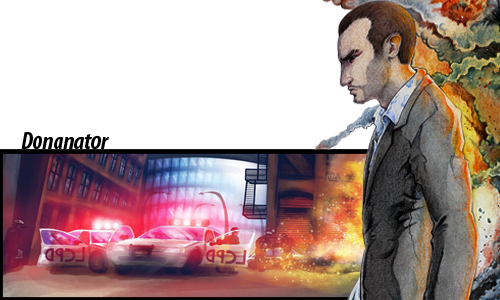
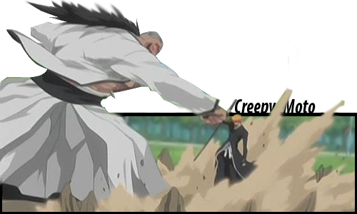
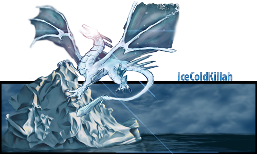
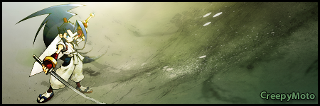
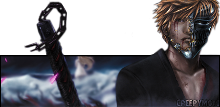
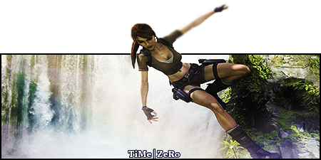
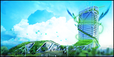
I see you're trying to master the pop-up signature which is a nice way to get some kinda "signature" sigs.
Anyway, gotta say you've got some nice ones and here are some remarks

:
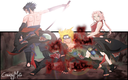
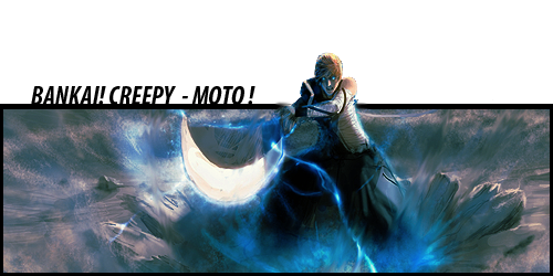
I noticed that you're having a bit of a problem cutting the render to look nice while its popping up, maybe use the polygonal lasso tool because it seems you're using the eraser tool which makes it look rather blurry.
Also, you're stretching some of your renders and making them look out of proportion.
And uhm, the border is getting boring, I mean you do have great ideas for the whole sigs but you should get a bit more creative on the borders.
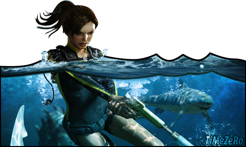
Nice idea on the tomb raider one, I liked it but you should work a bit more on the water surface, it looks kinda cartoonish.
In the gta one, the render looks out of place and the colors don't blend together but the rest has a nice flow in the color.
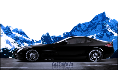
I liked the mercedes one the best even though it would've looked better with a gradient black to transparent border instead of the cut.
All in all, you've got the ideas and you've got the creativity, and that's the most important thing, just keep practicing and you'll do great. ^.^
