warbz's visuals
 Wizard
12 Dec 2007
Wizard
12 Dec 2007
Not bad mate, not bad at all. I like it. I won't bother to go into too much detail about it, save to say, (technically) simple and attractive.
Warbz
13 Dec 2007
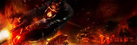
Ill be honest and say that i didnt do much to the background. (gears of war)
But i duplicate and rearrangeged the render around the foreground and did a gaussian blur and set the layer to overlay.
Then The actual render a did a "feather" and deleted the edges so it blends a bit.
And did a red overlay on the render to help it blend with the background as he was mostly blue to start.
Warbz
13 Dec 2007

Advice, critique, anything?
EDIT: I just noticed that the font is a bit squiff. lol
Edited by Warbz, 13 December 2007 - 08:32.
Wizard
16 Dec 2007
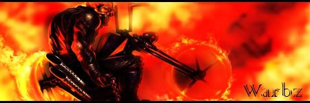
First off I am gonna assume that you are still on your laptop?! I actually quite like the sig. It has a simpleness to it that seems to work, however, technically speaking it is rather bland! The render has no effects or overlay and is straight from the cut! The BG, while nice, has no other effects save the mosaic or frag that you have applied. I do like the border you have made, wonder where the inspiration came from (?  ), but ulitmately it does seem devoid of any atmosphere or ambience. I'd really like to see this done again when you get your PC working again. I know that you can make this very very good if you spent sometime on it. You could have done something to blend the BG to the render, or smudged the render a few times and overlayed it on the explosion perhaps.
If I had to be brutal, I can really on give this a 6/10, primarily cause I know you can do better!
-W
), but ulitmately it does seem devoid of any atmosphere or ambience. I'd really like to see this done again when you get your PC working again. I know that you can make this very very good if you spent sometime on it. You could have done something to blend the BG to the render, or smudged the render a few times and overlayed it on the explosion perhaps.If I had to be brutal, I can really on give this a 6/10, primarily cause I know you can do better!
-W
Warbz
17 Dec 2007
No, I am now on my PC, with my brand new 8800GT, which im not meant to have till xmas. But i switched it with my old, so aslong as no-one tells my mum, and I can fake a shockes/pleased expession, all will be good. LMAO
I will do it again for you.
I will do it again for you.
Cattman2236
17 Dec 2007
 Warbz, on 16 Dec 2007, 16:23, said:

Awsome, I rather like the background, your certainly getting the hang of this now, Good job mate

Warbz
17 Dec 2007
Thankyou
@Wizard, I think I deleted the renders for that halo sig. (I need to stop doing it. lol)
New one:

@Wizard, I think I deleted the renders for that halo sig. (I need to stop doing it. lol)
New one:
Warbz
17 Dec 2007
IS there any particular reason that members see to avoid this thread like a disease?
Lord Atlantis
17 Dec 2007
Heh... do you mind sending me the link to that Halo render if you can. I would like to have it on hand for anything that I think up of... 
Wizard
18 Dec 2007
@ Lord Atlantis, in case Warbz hasn't yet linky
@ Warbz, sorry mate, internet had a spas last night and cut me off so have only just been able to log on. Aside from the fact that the render looks like someone suffering torture by water boarding, I like this sig. Good placement and use of dual tones. I think the bevel (or whateva effect) used doesn't do it justice though. Smooth work on the lightening. Font needs to suit more, something more prickly. 7.5/10 mate well done.
@ Warbz, sorry mate, internet had a spas last night and cut me off so have only just been able to log on. Aside from the fact that the render looks like someone suffering torture by water boarding, I like this sig. Good placement and use of dual tones. I think the bevel (or whateva effect) used doesn't do it justice though. Smooth work on the lightening. Font needs to suit more, something more prickly. 7.5/10 mate well done.
Warbz
18 Dec 2007
IF by bevel and emboss you mean the border, its just a 1px stroke border that was duplicated, one was turned to 70% transparency and the other was given a gaussian blur.
Wizard
18 Dec 2007
Yeah, what you said ^. Don't think it suits. For this one just a px overlay would work
Nid
18 Dec 2007
Warbz, on 17 Dec 2007, 10:21, said:
with my brand new 8800GT, which im not meant to have till xmas. But i switched it with my old, so aslong as no-one tells my mum, and I can fake a shockes/pleased expession, all will be good. LMAO
Can we have a video of your reaction so we can criticize your acting as well?
PS Sexy stuff.
Ellipsis
18 Dec 2007
Me likely Halo sig.
P.S. You like red a lot. Though overall great job, mate, :biggrin:.
P.S. You like red a lot. Though overall great job, mate, :biggrin:.
Sgt. Nuker
19 Dec 2007
Warbz, on 18 Dec 2007, 16:20, said:
and ive actually remembered to save renders etc. this time. lol
Red might be an okay and acceptible color, but you've got to pick your battles with it. In this case, red washes out key areas of the render. A black or blue background might have served you a bit better, but even then, dark colors can be unforgiving. Black might have been too extreme, as the render itself is mostly that color. Try doing a faded dark blue to slightly lighter blue , as that may yield a better result
 .
.My best,
Nuker
 .
.
Wizard
19 Dec 2007
Tough render to use mate, but I think you did do quite a good job. Although I agree with Nuker that perhaps black might have been a good choice. I have this render to and I think that it wouldn't have faded to the BG too much. But anyway, this is good. Different font perhaps. Something hellish would be good. Textz can kill a sig and while this one doesn't, it doesn't add to it or blend with it too well either 7.5/10. Keep thowing them at us.
