The Dr's Evil Creation Lab!
#626
Posted 31 August 2009 - 19:30

F O R T H E N S

#627
Posted 31 August 2009 - 19:41


Awesome radio
Quote
#628
Posted 31 August 2009 - 19:42

F O R T H E N S

#630
Posted 27 September 2009 - 11:41
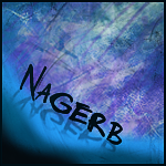

Just something i whipped up for Nagerb
He wanted something abstract so i tried my best.

F O R T H E N S

#631
Posted 27 September 2009 - 11:54

#633
Posted 27 September 2009 - 12:11


See if you can cook something nice up.
If it helps at all the first ship is a Hound (Stealth Bomber) and the second is a Hurricane (Battlecruiser).

#634
Posted 27 September 2009 - 17:05
 TheDR, on 27 Sep 2009, 7:41, said:


Just something i whipped up for Nagerb
He wanted something abstract so i tried my best.
The background looks like shards of glass or shattered ice, but the foreground to the right looks like smooth glass, or a tranquil lake. The reflection on the text is a very nice touch. With most of the signature looking detailed, I'm not sure the negative spaces (those with little detail and only colour) fit well, but then again, this is, as you've said, an abstract artwork. I do like the big and smaller spaces coupled with the downward movement the negative areas create, suggesting the text is sliding toward the middle.

#635
Posted 27 September 2009 - 17:44
I had some detail on the foreground bits but it just made the sig look far to crowded and i felt it took away the focus from the "shattered ice" BG.
About the refected text, i have been trying to add more depth in my sigs and i remembered my friend liked reflections, so i decided to add it in, it ended up working really well.
The whole of that sig was just made by a hell load of brushes in about 50 minutes, i will have to try more sigs like that in the future as it was very fun and rewarding to do.
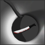
An Avvy i drew for my friend, Wreckchete.
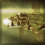

Your request Warbz, i was going to give up and say it was impossible to do anything decent with it, but i had a good go and i feel it came out alright.
Edit:


New sig for me
Edited by TheDR, 27 September 2009 - 19:19.

F O R T H E N S

#636
Posted 27 September 2009 - 19:38
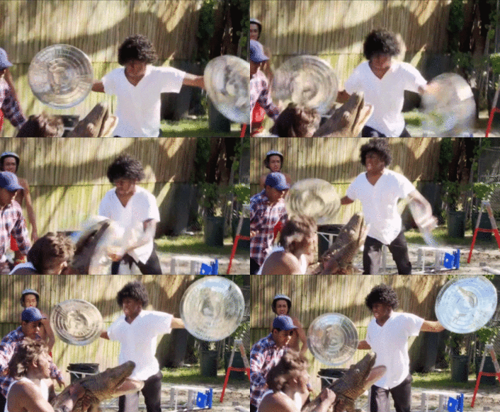
#638
Posted 27 September 2009 - 19:52
Concering Nagerb's sig, I think that the left side could've been better if you haven't included the smudged part, and used only the grunge brushes while darkening a bit the right side's smudge
#641
Posted 18 October 2009 - 11:26

F O R T H E N S

#643
Posted 22 October 2009 - 22:39
 su8perkillr, on 22 Oct 2009, 23:33, said:
Have you got some pictures i could use?

F O R T H E N S

#646
Posted 15 November 2009 - 20:37
JRK's sig/avvy combo. I really like these, they were fun to do.
I used the BC2 Fanpack 2 for the images and cut them out using PS, the BF logo was already chopped. I also removed a part of a gun which was sticking over the sig dude's arm.
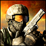

A logo i made for the Machinima Project.

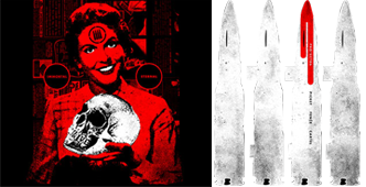
A sig i made for Nooker, which was just a basic cut job.

F O R T H E N S

#648
Posted 15 November 2009 - 22:27
- The Hammer and Sickle
- An AK47, (U) version or not, your call
- With a Russian Brown Bear in the background.
I ask that you not give this picture a background outside of the bear, so we can drag and drop on our renders.
Thanks DR, and Pav3d. I know I already asked you for this. Just using my resources.

#649
Posted 28 November 2009 - 22:51
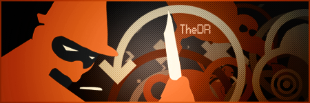
I used some of the icons from the TF2 achievements, someone on the TF2 forums made vector versions..

F O R T H E N S

1 user(s) are reading this topic
0 members, 1 guests, 0 anonymous users


