Jump to content


[*AfterFlash's Art Store*]


  • This topic is locked This topic is locked
109 replies to this topic

#76 Wizard

    [...beep...]

  • Administrator
  • 9627 posts

Posted 10 December 2007 - 23:34

View PostAfterFlash, on 10 Dec 2007, 23:21, said:

The USA Sig!
Posted Image


I like this much better than the GLA one my friend. Probably because the copied renders don't clash as much on this. The right hand logo is still more prominent, but not to the rather disorientated extent as before. This is good work, I would just not have used that brush on the corners tbh. Perhaps you could've duplicated the hegaxons, rippled them, then erased the middle part so you have the edges distorted but not the centre. Keep up the sig making mate.

- W

#77 AfterFlash

    Title

  • Member Test
  • 924 posts

Posted 11 December 2007 - 05:00

View PostMajor Nuker, on 10 Dec 2007, 17:30, said:

Do I smell a Chinese "stock" sig around the corner as well, because I' starting to see a pattern :D ?


Hmmm... wouldn't you like to know.. Does this answer your question?
Posted Image

P.S: I couldn't find a good China logo, that's why the outlines are so messy.

And by the way, I'm going to add like renders and crap into these sigs next, followed by their generals. :rofll:

#78 AfterFlash

    Title

  • Member Test
  • 924 posts

Posted 11 December 2007 - 22:17

Sorry for 2 post, but are there any requests??

#79 Wizard

    [...beep...]

  • Administrator
  • 9627 posts

Posted 11 December 2007 - 22:30

Yeah, can you change the USA one to a blur. Would like to see that.

#80 AfterFlash

    Title

  • Member Test
  • 924 posts

Posted 11 December 2007 - 22:59

EDIT: Nevermind.

Here is my remodified USA Sig!!
Posted Image
Kinda blurred and sharpened the icon just a bit. The borders have been edited as well, BTW, if anyone is using GIMP, can you help me make cool sigs? Because as you can tell, I'm not very good..

Edited by AfterFlash, 11 December 2007 - 23:34.


#81 Warbz

    IRC is just a multiplayer notepad.

  • Project Team
  • 4646 posts

Posted 12 December 2007 - 08:34

The background in these sigs seem to have absolutely no relevance to the foreground, apart from in terms of color

Posted Image

#82 Wizard

    [...beep...]

  • Administrator
  • 9627 posts

Posted 12 December 2007 - 09:17

View PostAfterFlash, on 11 Dec 2007, 22:59, said:

Here is my remodified USA Sig!!
Posted Image
Kinda blurred and sharpened the icon just a bit. The borders have been edited as well

I think this is better than the previous, whilst the corners are actually harded to see now cause of the blur it makes it look better because of subltey. This is a definite improvement IMO. Though perhaps you might have wanted to erase the blurred layer towards the middle a bit more.

View PostAfterFlash, on 11 Dec 2007, 22:59, said:

BTW, if anyone is using GIMP, can you help me make cool sigs? Because as you can tell, I'm not very good..

PM me. I'd quite like to chat to you actually anyway :P

Edited by Wizard, 12 December 2007 - 09:17.


#83 AfterFlash

    Title

  • Member Test
  • 924 posts

Posted 12 December 2007 - 22:55

View PostWarbz, on 12 Dec 2007, 2:34, said:

The background in these sigs seem to have absolutely no relevance to the foreground, apart from in terms of color


Thanks for the advice, I'll keep that in mind next time I make a sig. ;)

View PostWizard, on 12 Dec 2007, 3:17, said:

PM me. I'd quite like to chat to you actually anyway


Ok, thanks I'll PM you.

Edited by AfterFlash, 12 December 2007 - 22:57.


#84 AfterFlash

    Title

  • Member Test
  • 924 posts

Posted 14 December 2007 - 01:41

Hey why is no one coming anymore? Me sad..

#85 Wizard

    [...beep...]

  • Administrator
  • 9627 posts

Posted 14 December 2007 - 13:26

Give us something new! We are members of the MTV generation and our attentions spans ............................... :)

#86 AfterFlash

    Title

  • Member Test
  • 924 posts

Posted 17 December 2007 - 22:23

O..k... Anyway, here's a sig to advertise my mod.

Posted Image

Hope you enjoy it. And BTW, I have Photoshop now, just don't know how to use it...

#87 Lord Atlantis

    I am Iron Man

  • Member
  • 3807 posts

Posted 17 December 2007 - 23:56

I think that you should bring the Generals "Hour of Chaos" logo out in front of the border... it will help with the clarity of it. But its ok all in all...
Posted Image

#88 Dauth

    <Custom title available>

  • Gold Member
  • 11193 posts

Posted 17 December 2007 - 23:59

From what I've seen photoshop will greatly enhance your sigs, work hard at learning and it will pay off.

#89 Wizard

    [...beep...]

  • Administrator
  • 9627 posts

Posted 18 December 2007 - 08:16

Ho Ho Merry Photoshop Afterflash! Glad to see you have joined the darkside, finally. As I said to you the other day it will very much make a difference to your skillz. I see your kung foo growing stronger already! If you want to know something mate just ask me! Nice logo btw, better that the other one. Am working on what we discussed still though.

#90 AfterFlash

    Title

  • Member Test
  • 924 posts

Posted 19 December 2007 - 00:06

Remodified Sig :

Posted Image

Thanks to Wizard's advice!

#91 Ellipsis

    <Custom title available>

  • Member
  • 806 posts
  • Projects: Co-Leader of Zero Hour:Unleashed

Posted 19 December 2007 - 00:10

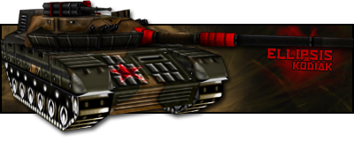
Maybe change the font of Hour of Chaos? Thats just my opinion.
Posted Image
Thanks for the sig and avatar, 'Dr.

#92 Wizard

    [...beep...]

  • Administrator
  • 9627 posts

Posted 19 December 2007 - 00:25

Improving. For effort you get high marks and I am not going to bring you down with crit today as this is your first real go with PS. I will say you have huge potential my friend. HUGE. Perfection comes with time. I am a bit concerned about the pixelation of the logo. Think maybe the render was over cut. Try to make the emboss on the HOC text more subtle because at this size it just makes it hazy.

Keep it up!
- W

#93 AfterFlash

    Title

  • Member Test
  • 924 posts

Posted 21 December 2007 - 03:50

Ok. this is my last and finished product.

Posted Image

Whew... took me a while to make it but.. as long as it all pays off I guess..

#94 Lord Atlantis

    I am Iron Man

  • Member
  • 3807 posts

Posted 21 December 2007 - 03:55

I think that the three symbols for the sides should be behind it because it gets in the way of the logo, but otherwise nice job. =)
Posted Image

#95 AfterFlash

    Title

  • Member Test
  • 924 posts

Posted 22 December 2007 - 18:56

PS is confusing you know I tried to use GIMP on it and still the "Addition" thing doesn't solve the entire problem.

#96 Lord Atlantis

    I am Iron Man

  • Member
  • 3807 posts

Posted 22 December 2007 - 18:59

Why not keep the same effect of the renders, but move their layer to behind the logo's layer?
Posted Image

#97 AfterFlash

    Title

  • Member Test
  • 924 posts

Posted 22 December 2007 - 19:02

Then you can't see it, my plan was to place some effects (along with the logos) within the "GENERALS" logo without letting the effects affect the background.

#98 Lord Atlantis

    I am Iron Man

  • Member
  • 3807 posts

Posted 22 December 2007 - 19:07

I would try a "Grain Merge" action instead of addition. It may get better results. :P
Posted Image

#99 AfterFlash

    Title

  • Member Test
  • 924 posts

Posted 22 December 2007 - 19:09

Hmm.. well ok I think I'll try that. Anyway, do you know of a good website where I can get Generals and other games renders?

#100 Lord Atlantis

    I am Iron Man

  • Member
  • 3807 posts

Posted 22 December 2007 - 19:14

Check out the Sig Help Desk. You should be able to get some good links where you need to go, especially since you are a PS user. :P

Do you need some high-res screens of the general's logos?
Posted Image


1 user(s) are reading this topic

0 members, 1 guests, 0 anonymous users