Jump to content


Wizard's Signatures


236 replies to this topic

#126 Sgt. Nuker

    Greenskin Inside

  • Global Moderator
  • 13457 posts
  • Projects: Shoot. Chop. Smash. Stomp.

Posted 21 December 2007 - 20:31

Wizard, how do you expect people to give you a thorough critique of each signature if you upload 50 million of them :P . I haven't a clue of where to begin, but here it goes:

The Daredevil signature is among your best. Faded fractals (yes? no?.....I'm just guessing here :P ) appear as broken glass and to the left side of the signature, Daredevil looks like he's been ripped straight from a comic book. As you pan to the right, the render appears more real life, giving the signature a sort of fourth dimension in the respect it has both width, length, depth, and two different realms.

The Ironhide signature sort of falls into the same vain as the Daredevil one, minus the faded shards of course. Here I see a burnt image of what was once color and a type of mock light source on the left, shifting the focus to that side. This is opposite of the Daredevil sig, and when stacked as you have them, it adds a certain element that few people have.

Your showcasing technique is one of a pioneering move, as I've seen others just post a bunch of signatures, relying on the blue (or red) background to help them. You went a level above and placed the signatures on a background of their own.

The Starcraft Terran seems to be bathed in purple plasma. The light source on this one is more centralized, accenting the face of the render and the front/top armor. One thing that stands out, is the blurred haze around the text. The text is still legible, which comes as a bonus, because the hazing effect is still pulled off remarkably well and fits into the overall theme much better than just plain text.

Your first Spawn signature was rather dark, and it was hard to pic out the outter most edges of detail. Spawn is a dark character, but despite what he might be, we want to see him :read . Your remake is ten times better, since the black void is now filled with sparks and vibrant color. It brings the signature up to the level is should be at.


My best,

Nuker
Posted Image

#127 Lord Atlantis

    I am Iron Man

  • Member
  • 3807 posts

Posted 22 December 2007 - 06:40

You signatures are almost too perfect, I really can't point out where you can improve.

It just amazes me how you can make some stuff like that... :P
Posted Image

#128 Wizard

    [...beep...]

  • Administrator
  • 9627 posts

Posted 23 December 2007 - 21:44

Thank you for the comments guys. They are really appreciated. I think I am getting the hang of this different style, now I have adapted it a bit. Major, think I will keep updates down to 3 each time ;). Sorry mate. But thanks for the critique anyways.

So, I have entered a SOTW on another forum. Which of the two entries do you prefer?
Entered version:
TAG REMOVED - STOCK COPYRIGHTED
Amended version:
TAG REMOVED - STOCK COPYRIGHTED

EDIT: Just found out that the stock provided by the site was copyrighted, that was clever thinking! :P

Edited by Wizard, 26 December 2007 - 01:33.


#129 Lord Atlantis

    I am Iron Man

  • Member
  • 3807 posts

Posted 23 December 2007 - 23:58

Top one. The right area on the bottom one looks like it was randomly thrown in to take up some space. I really am not seeing the point of it.
Posted Image

#130 Sgt. Nuker

    Greenskin Inside

  • Global Moderator
  • 13457 posts
  • Projects: Shoot. Chop. Smash. Stomp.

Posted 24 December 2007 - 00:21

The amended version seems like a stray piece of film or an image from a movie that the projector's gone haywire on. To be fair, it is a rather good bit of kit in its own right, but maybe it's because I don't fully understand the reason for the repetition on the right hand side. If both images are the same, save for their right side, it doesn't appear so. The amended version seems brighter, if only by a little bit. Maybe I'm seeing something that isn't truly there, but ah well. I'd say go with the top one too.


My best,

Nuker
Posted Image

#131 Wizard

    [...beep...]

  • Administrator
  • 9627 posts

Posted 24 December 2007 - 01:02

View PostLord Atlantis, on 23 Dec 2007, 23:58, said:

Top one. The right area on the bottom one looks like it was randomly thrown in to take up some space. I really am not seeing the point of it.


It's sort of a mixed approached. As the good Major has astutely noticed, it is designed to add to the cinematic/stop frame nature of the tag. Imagine if you will a film reel that has snagged and caught on the projector. You end up seeing a snap shot of a previous frame within the next frame. But also it's used to draw some attention to another area of the tag that is more interesting. Perhaps I could've chosen a more detailed or vibrant portion to recreate I admit, hence perhaps, the random feel you are getting. This is the first time I have tried this in a sig and maybe needs some work :P . Thanks for your crit though Atlantis and to Nuker to. Can always rely on you guys for some help ;)

#132 Wizard

    [...beep...]

  • Administrator
  • 9627 posts

Posted 30 December 2007 - 13:07

I just wanted you all to know that while I maybe working on the sig craze website alot I will still be posting works here. Requests are still taken, obviously (and at TSC).

In the meantime and in a blatant plug, I have finished a new tutorial for pop-up signatures. I will only link it to the TSC and you need to be a member to see it as well, but I can't help trying to generate some interest.

This is the link and this is the outcome

Posted Image

You might remember it!

Regards
Wizard

Edited by Wizard, 30 December 2007 - 13:08.


#133 Wizard

    [...beep...]

  • Administrator
  • 9627 posts

Posted 01 January 2008 - 23:46

I am not sure whether any has (or even can see my new avvy yet) but I have been tinkering around with some stuff and have come up with this.

Posted Image

and this one

Posted Image

If anyone would like an image buttonised then let me know. Other flags can be done in about 20 seconds. Can't remember whether I have seen this before on the forum but can not be bothered to search for it.

#134 Pav:3d

    YOUR WORLDS WILL BECOME OUR LABORATORIES

  • Project Leader
  • 7224 posts
  • Projects: EC, CORE, ER

Posted 07 January 2008 - 13:51

hello wizard, i looked over your many MANY bits of artwork, all very very nice ;)

thanks for your pm, i thought nobody would bother replying :D

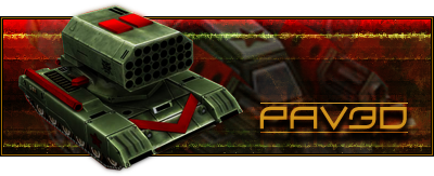
i would liiike to request a leang based sig with the buratino n advanced flame tank with my name just anywhere in it, any attempt would be greatly appreciated

thanks again for your reply! i look very much forward to it

Posted Image

Posted Image

#135 Wizard

    [...beep...]

  • Administrator
  • 9627 posts

Posted 07 January 2008 - 14:09

Consider it done mate!

#136 Pav:3d

    YOUR WORLDS WILL BECOME OUR LABORATORIES

  • Project Leader
  • 7224 posts
  • Projects: EC, CORE, ER

Posted 07 January 2008 - 18:42

:D

thank you very much!

i v much look forward to seeing it :drunk:

Posted Image

Posted Image

#137 Wizard

    [...beep...]

  • Administrator
  • 9627 posts

Posted 07 January 2008 - 19:56

So here it is

Posted Image

Hope you like it

#138 Pav:3d

    YOUR WORLDS WILL BECOME OUR LABORATORIES

  • Project Leader
  • 7224 posts
  • Projects: EC, CORE, ER

Posted 07 January 2008 - 23:30

:)

just brilliant, i love it :)

thanks SOOOOO much :wow:
it looks so damn professional, and you made it so much sooner than i thought u would :D hope it wasnt too much trouble its greatly appreciatted

absolutely perfect, just what i was looking for, ur a pal! :P

Posted Image

Posted Image

#139 Whitey

    <Custom title available>

  • Member
  • 8743 posts

Posted 07 January 2008 - 23:33

Wow. Looks really nice.

#140 Jok3r

    veritas vos liberabit

  • Project Team
  • 1909 posts
  • Projects: Hangar 13 Projects

Posted 07 January 2008 - 23:59

What does wizard makes that doesn't look very nice?
kinda, sorta alive.


#141 Wizard

    [...beep...]

  • Administrator
  • 9627 posts

Posted 08 January 2008 - 00:22

Glad you liked it Pav3d. I haven't made a sig in that style for a while so you got quite lucky with the result :P

Boidy - Wait till you see your finished one mate! It's still very much a WIP right now. I want to get it right and am taking my time over it if that's ok with you?

#142 Sgt. Nuker

    Greenskin Inside

  • Global Moderator
  • 13457 posts
  • Projects: Shoot. Chop. Smash. Stomp.

Posted 08 January 2008 - 00:36

I think Pav3d is a bit of a pyro :P . Leang's Flame tank as the background and a TOS-1 as the main render, all he's missing is a fat Cuban cigar to smoke while he immolates the enemy. I do like the two yellow-green lines as they look like seismograph lines (would be appropriate for Leang's other hobby :) .

Nice work Wizard, looks like you've got another satisfied customer.


My best,

Nuker
Posted Image

#143 Whitey

    <Custom title available>

  • Member
  • 8743 posts

Posted 08 January 2008 - 00:58

View PostWizard, on 7 Jan 2008, 18:22, said:

Boidy - Wait till you see your finished one mate! It's still very much a WIP right now. I want to get it right and am taking my time over it if that's ok with you?


I'm not worried. Thanks. :P

#144 Pav:3d

    YOUR WORLDS WILL BECOME OUR LABORATORIES

  • Project Leader
  • 7224 posts
  • Projects: EC, CORE, ER

Posted 08 January 2008 - 10:24

View PostMajor Nuker, on 8 Jan 2008, 0:36, said:

I think Pav3d is a bit of a pyro :) . Leang's Flame tank as the background and a TOS-1 as the main render, all he's missing is a fat Cuban cigar to smoke while he immolates the enemy.


:P

indeed! :)

@wizard: hope ive linked your thread alright in my sig, unless you rather i linked ur profile or summin else?

Posted Image

Posted Image

#145 Wizard

    [...beep...]

  • Administrator
  • 9627 posts

Posted 08 January 2008 - 13:32

The link to the artwork thread is fine, thank you Pav3d. Very kind of you.

#146 Wizard

    [...beep...]

  • Administrator
  • 9627 posts

Posted 17 January 2008 - 01:28

*Muchos Chanting and dark magic*

By the power of necro I bring you two short pieces that currently occupy my sig space.

What are your thoughts Gentlement and of course Ladies

Posted Image
Posted Image

slightly older

Posted Image

and something I made for someone for off forum

Posted Image

Edited by Wizard, 17 January 2008 - 01:30.


#147 Whitey

    <Custom title available>

  • Member
  • 8743 posts

Posted 17 January 2008 - 01:50

*Is dying of anticipation*

They are really well-done. I can't help but feel the renders are a bit small compared to the signatures. They are blended exquisitely though.

#148 Wizard

    [...beep...]

  • Administrator
  • 9627 posts

Posted 17 January 2008 - 08:24

Don't worry mate it's on it's way and looking quite good. I am thinking early next week, should give me the weekend to finish off and tidy up.

Thanks for the comment. The sprite sig style is fairly limited in the render size area as it is bound by the small size of the sprites anyway. Though I think Akuma was slightly larger than the rest.

#149 Red

    Smell No Evil!!

  • Member
  • 581 posts
  • Projects: Nothing but posting...

Posted 17 January 2008 - 09:55

Can I have one with Basilisk Tank VS Devastator with my name in :P please :/
Fav. mod:
-SWR
-Contra
-Tiberium Essence

Got juice!?

#150 Wizard

    [...beep...]

  • Administrator
  • 9627 posts

Posted 17 January 2008 - 18:44

Of course. But when you say "VS Devastator" you mean

<Picture>Basilisk</picture> "Vs" *Your name in text*

I will do it, but I should probably finish Boidy's tag first, so might be the weekend. Is that ok?

btw w00t 1,000th post!!!! ;)

Edited by Wizard, 17 January 2008 - 22:32.


1 user(s) are reading this topic

0 members, 1 guests, 0 anonymous users