. I haven't a clue of where to begin, but here it goes:
The Daredevil signature is among your best. Faded fractals (yes? no?.....I'm just guessing here
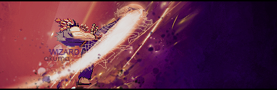
) appear as broken glass and to the left side of the signature, Daredevil looks like he's been ripped straight from a comic book. As you pan to the right, the render appears more real life, giving the signature a sort of fourth dimension in the respect it has both width, length, depth, and two different realms.The Ironhide signature sort of falls into the same vain as the Daredevil one, minus the faded shards of course. Here I see a burnt image of what was once color and a type of mock light source on the left, shifting the focus to that side. This is opposite of the Daredevil sig, and when stacked as you have them, it adds a certain element that few people have.
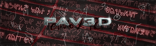
Your showcasing technique is one of a pioneering move, as I've seen others just post a bunch of signatures, relying on the blue (or red) background to help them. You went a level above and placed the signatures on a background of their own.
The Starcraft Terran seems to be bathed in purple plasma. The light source on this one is more centralized, accenting the face of the render and the front/top armor. One thing that stands out, is the blurred haze around the text. The text is still legible, which comes as a bonus, because the hazing effect is still pulled off remarkably well and fits into the overall theme much better than just plain text.
Your first Spawn signature was rather dark, and it was hard to pic out the outter most edges of detail. Spawn is a dark character, but despite what he might be, we want to see him :read . Your remake is ten times better, since the black void is now filled with sparks and vibrant color. It brings the signature up to the level is should be at.
My best,
Nuker


 . Sorry mate. But thanks for the critique anyways.

 . Thanks for your crit though Atlantis and to Nuker to. Can always rely on you guys for some help


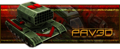

 . Leang's Flame tank as the background and a TOS-1 as the main render, all he's missing is a fat Cuban cigar to smoke while he immolates the enemy. I do like the two yellow-green lines as they look like seismograph lines (would be appropriate for Leang's other hobby