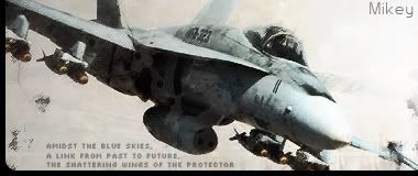
8/10

Rate teh Siggy!
Started By Baal-Zebub, Mar 16 2006 02:36
2198 replies to this topic
#1426
-
- Member Test
-

- 547 posts
Der Metzgermeister
Posted 30 June 2007 - 03:42

my sig showroom kick!!
http://500px.com/schwarzk0pf
glouf, on 23 Jun 2006, 16:51, said:
I like to call him Dr. Spamkopf
#1427
-
- Project Team
-

- 4073 posts
[Pantsu-Dan]
-
Projects: Commanding the ECA 33rd Ground Assault Team.
Posted 02 July 2007 - 11:12
Nice effects  10/10
10/10
10/10


 Black Lagoon OST
#1428
-
- Member
-
- 507 posts
<Custom title available>
-
Projects: Harvesting Tiberium 24/7
Posted 02 July 2007 - 11:13
Now that's what i call a 'MAJOR' Improvement
9.5/10 very nice!
9.5/10 very nice!

Above sig by Vertigo
#1429
-
- Project Team
-
- 4073 posts
[Pantsu-Dan]
-
Projects: Commanding the ECA 33rd Ground Assault Team.
Posted 02 July 2007 - 11:17
10/10 anything more to say
Black Lagoon OST#1430
-
- Member
-
- 507 posts
<Custom title available>
-
Projects: Harvesting Tiberium 24/7
Posted 03 July 2007 - 14:30
9/10 lookin pretty good i must say...
and it's very similar too!
and it's very similar too!
Above sig by Vertigo
#1431
-
- Member Test
-
- 924 posts
Title
Posted 03 July 2007 - 14:39
11/10 if it's allowed. I don't know how you made those effects and cut them into that shape. I see the lighting effects and shadows, not to mention yours look alot like Kid's. lol! 
#1432
-
- Member
-
- 507 posts
<Custom title available>
-
Projects: Harvesting Tiberium 24/7
Posted 03 July 2007 - 14:56
Actually, It's the other way around
7.5/10, could do a little fixin' with the text, make it more clear and less blurred
remove the borders, and make the white part, transparent...
that way, it will blend better with the background :listen:
7.5/10, could do a little fixin' with the text, make it more clear and less blurred
remove the borders, and make the white part, transparent...
that way, it will blend better with the background :listen:
Above sig by Vertigo
#1433
-
- Project Team
-
- 4073 posts
[Pantsu-Dan]
-
Projects: Commanding the ECA 33rd Ground Assault Team.
Posted 03 July 2007 - 14:58
10/10 XD
VISTA
VISTA
Black Lagoon OST#1434
-
- Member Test
-
- 924 posts
Title
Posted 03 July 2007 - 15:08
Your sig is a 10/10. Could beat Distant Thunder's though.
#1435
-
- Project Team
-
- 4073 posts
[Pantsu-Dan]
-
Projects: Commanding the ECA 33rd Ground Assault Team.
Posted 07 July 2007 - 23:35
nice one 8/10 but IMHO need better font
Black Lagoon OST#1436
-
- Member
-
- 390 posts
Professional
-
Projects: Resident Knicker.
Posted 08 July 2007 - 01:22
7/10, very nice.
~V.
~V.

-Tha' rewf iz awn fiyah-
#1437
-
- Project Team
-
- 6796 posts
Divine Chaos
-
Projects: Sigma Invasion
Posted 08 July 2007 - 18:04
7.5/10 no comment.

Insomniac!, on 16 Sep 2008, 20:12, said:
Soul you scare the hell out of me, more so than Lizzie.
I've been given a Bob coin from Mr. Bob, a life time supply of cookies from Blonde-Unknown, some Internet Chocolate from the Full Throttle mod team, and some Assorted Weapons from Høbbesy.
#1438
-
- Member
-
- 8743 posts
<Custom title available>
Posted 08 July 2007 - 19:24
6/10
The first one is too dark looking... the second isn't blended well enough.
The quotes are kind of boring.
The first one is too dark looking... the second isn't blended well enough.
The quotes are kind of boring.
#1439
-
- Gold Member
-

- 4802 posts
People-Hater
Posted 08 July 2007 - 19:26
8/10
Not particularly my thing but technically a decent sig.
Not particularly my thing but technically a decent sig.
#1440
-
- Member
-
- 173 posts
Regular
Posted 08 July 2007 - 19:51
9.5/10, simple design and a great theme (Nod ftw!)
#1441
-
- Project Team
-
- 4073 posts
[Pantsu-Dan]
-
Projects: Commanding the ECA 33rd Ground Assault Team.
Posted 08 July 2007 - 21:16
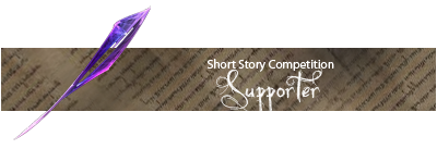
Nice Hornet sig 8'5/10
5/10 to sloganizer banner if that can have an alpha channel...
and 10/10 for the quote lol
5/10 to sloganizer banner if that can have an alpha channel...
and 10/10 for the quote lol
Black Lagoon OST#1442
-
- Member
-
- 741 posts
Archiver / Dream addict
-
Projects: Going nowhere slow ... With one more cup of tea
Posted 09 July 2007 - 15:45
6/10 Funky ,but I am no lover of anime
If you have something to contribute for the Shockwave archive please share or point me to it !

[indent][indent] [/indent][/indent]
 And greatest gratitude goes for Kid and Sic ! ;)
[indent][indent] [/indent][/indent]
And greatest gratitude goes for Kid and Sic ! ;)
#1443
-
- Member Test
-
- 4358 posts
The word is law. The law is love.
-
Projects: stayin' alive
Posted 09 July 2007 - 20:41
7/10
I like the kinda dirty-gritty look, but it doesn't look as polished as it should.
I like the kinda dirty-gritty look, but it doesn't look as polished as it should.

Ion Cannon in IRC said:
[19:11] <+IonCannnon> Basically, billychaka is a heartless bastard.
#1444
-
- Member
-
- 8743 posts
<Custom title available>
Posted 09 July 2007 - 20:43
7/10, the cartoony look is eye-catching and the fiery colors are nice, but the white border detracts in my opinion.
#1445
-
- Member Test
-
- 547 posts
Der Metzgermeister
Posted 10 July 2007 - 07:32
10/10
my sig showroom kick!!
http://500px.com/schwarzk0pf
glouf, on 23 Jun 2006, 16:51, said:
I like to call him Dr. Spamkopf
#1446
-
- Member Test
-
- 4358 posts
The word is law. The law is love.
-
Projects: stayin' alive
Posted 10 July 2007 - 17:13
8/10
I love the contrasting colors on the second banner.
I love the contrasting colors on the second banner.
Ion Cannon in IRC said:
[19:11] <+IonCannnon> Basically, billychaka is a heartless bastard.
#1447
-
- Member Test
-
- 547 posts
Der Metzgermeister
Posted 10 July 2007 - 17:17
8/10
my sig showroom kick!!
http://500px.com/schwarzk0pf
glouf, on 23 Jun 2006, 16:51, said:
I like to call him Dr. Spamkopf
#1448
-
- Member Test
-
- 4358 posts
The word is law. The law is love.
-
Projects: stayin' alive
Posted 11 July 2007 - 05:15
Same score
I just gotta new one and I wanna know what people think of it.
I just gotta new one and I wanna know what people think of it.
Ion Cannon in IRC said:
[19:11] <+IonCannnon> Basically, billychaka is a heartless bastard.
#1449
-
- Member
-
- 8743 posts
<Custom title available>
Posted 11 July 2007 - 05:36
6, I'd say a mild downgrade honestly. Though I do like the cobblestone pattern in the background. Other than that it is a lot less.... full and a bit too square for my liking.
#1450
-
- Member Test
-
- 1448 posts
The Music Man
Posted 11 July 2007 - 05:52
1.2/10
Dont like the darkness of it, althought the placement of pic and the cutting is nice
Dont like the darkness of it, althought the placement of pic and the cutting is nice
1 user(s) are reading this topic
0 members, 1 guests, 0 anonymous users

