9.98/10 - Can't beat The Dr's sigs!

Rate teh Siggy!
Started By Baal-Zebub, Mar 16 2006 02:36
2198 replies to this topic
#1852
-
- Member
-

- 1870 posts
America's Rage Leader
-
Projects: Americas Rage
Posted 02 June 2008 - 00:45
7/10
Tell
 TehKiller, on 1 Jun 2008, 16:50, said:
7.5/10
Not bad but could use some improvements
Not bad but could use some improvements
Tell
#1853
-
- Member
-
- 211 posts
Semi-Pro
-
Projects: Just Chilling
Posted 02 June 2008 - 07:57
8/10 Trippy and rasta
#1854
-
- Member Test
-
- 2197 posts
Grand Poobah and Lord High Everything Else
-
Projects: Where parallels meet.
Posted 02 June 2008 - 08:27
4/10 its anime meh
 19681107
#1855
-
- Member
-
- 211 posts
Semi-Pro
-
Projects: Just Chilling
Posted 02 June 2008 - 08:29
5/10 its a stripy flag meh (it is a pretty cool stripy flag though  )
)
)

#1858
-
- Gold Member
-

- 4950 posts
Light up life.
Posted 02 June 2008 - 20:54
8.5/10 - the cut off is a little drastic - but the render cutout is nice.
PS - the cutoff of the sig - not of the point that her shirt goes further down her chest - jeez you lot!
PS - the cutoff of the sig - not of the point that her shirt goes further down her chest - jeez you lot!
Edited by AjPod, 02 June 2008 - 20:55.
For there can be no death without life.
#1859
-
- Administrator
-

- 5853 posts
Whispery Wizard
Posted 02 June 2008 - 21:11
I like it, but i don't understand why the tennis ball is there
8/10
8/10

F O R T H E N S

#1860
-
- Gold Member
-
- 4950 posts
Light up life.
Posted 02 June 2008 - 21:13
Because I like playing tennis - 4 u - nice sig 9.79817/10
For there can be no death without life.
#1861
-
- Project Team
-

- 4073 posts
[Pantsu-Dan]
-
Projects: Commanding the ECA 33rd Ground Assault Team.
Posted 02 June 2008 - 21:16
I love it, but what I don't get, is, why the tennis ball?
10-10
10-10


 Black Lagoon OST
#1862
-
- Member
-
- 211 posts
Semi-Pro
-
Projects: Just Chilling
Posted 02 June 2008 - 21:38
AjPod, on 2 Jun 2008, 21:54, said:
but the render cutout is nice
Hehe that's because I didn't do it
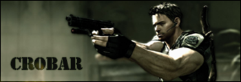
4/10
Edited by Crobar, 02 June 2008 - 21:41.
#1863
-
- Gold Member
-
- 4950 posts
Light up life.
Posted 03 June 2008 - 09:59
Meh - well I'll rate it again at 8.56/10!
For there can be no death without life.


#1865
-
- Gold Member
-
- 4950 posts
Light up life.
Posted 03 June 2008 - 13:29
Meh 8/10
For there can be no death without life.
#1867
-
- Member
-
- 397 posts
Professional
Posted 03 June 2008 - 20:00
6/10

48 65 6c 6c 6f 2c 20 77 6f 72 6c 64 21
#1869
-
- Member
-
- 1870 posts
America's Rage Leader
-
Projects: Americas Rage
Posted 04 June 2008 - 23:18
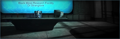
4/10
Is it simplicity? Or you cant be bothered? or lack of l33t skillz like me
Is it simplicity? Or you cant be bothered? or lack of l33t skillz like me
#1870
-
- Project Team
-
- 2351 posts
girl eater
Posted 04 June 2008 - 23:39
5/10 more like lack of bad taste... 
it's time to wake up
#1871
-
- Gold Member
-
- 4950 posts
Light up life.
Posted 05 June 2008 - 00:25
6/10 a bit of a lack of depth.
For there can be no death without life.
#1872
-
- Project Team
-
- 4073 posts
[Pantsu-Dan]
-
Projects: Commanding the ECA 33rd Ground Assault Team.
Posted 05 June 2008 - 14:34
10/10. Excellent Placement of the font. Also nice font.
Black Lagoon OST#1873
-
- Administrator
-
- 5853 posts
Whispery Wizard
Posted 05 June 2008 - 15:16
Nice sig, it looks slick.
9/10
9/10
F O R T H E N S
#1874
-
- Project Team
-
- 2351 posts
girl eater
Posted 05 June 2008 - 15:33
timesplitters ftw
9.5/10
9.5/10
it's time to wake up
#1875
-
- Member
-
- 211 posts
Semi-Pro
-
Projects: Just Chilling
Posted 05 June 2008 - 18:36
7/10 I agree simplicity is the key (most of the time)
2 user(s) are reading this topic
0 members, 2 guests, 0 anonymous users

