Miku's head shouldn't be with the lines, maybe from her shoulders


Forum Nakadashi-er
Posted 19 March 2009 - 17:48
Professional
Posted 22 March 2009 - 16:35
Forum Nakadashi-er
Posted 23 March 2009 - 06:53
Grand Admiral, Deimos Fleet, Red Banner
Posted 23 March 2009 - 10:29
Quote


Whispery Wizard
Posted 23 March 2009 - 10:50


Forum Nakadashi-er
Posted 23 March 2009 - 11:53

Professional
Posted 23 March 2009 - 12:23
Ecchi Toaster
Posted 25 March 2009 - 13:17


Quote
Professional
Posted 25 March 2009 - 13:23
Light up life.
Posted 25 March 2009 - 13:45
YOUR WORLDS WILL BECOME OUR LABORATORIES
Posted 25 March 2009 - 14:03
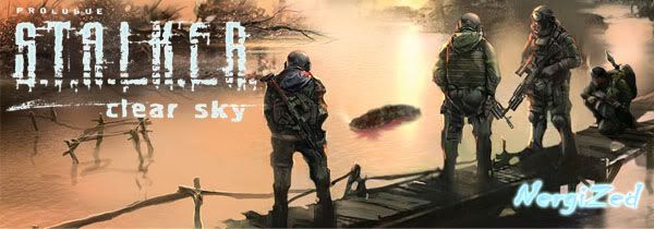
and everyones got those steam thingies nowadays...

^^^ Pronouced like the battery brand ^^^
Posted 25 March 2009 - 14:51
Edited by NergiZed, 25 March 2009 - 14:52.
Professional
Posted 25 March 2009 - 15:38
^^^ Pronouced like the battery brand ^^^
Posted 25 March 2009 - 19:40
YOUR WORLDS WILL BECOME OUR LABORATORIES
Posted 25 March 2009 - 20:12
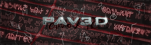
 @wormalicious xD The name was actually made up from parts of the boss render Be nice if you could extend the flag to the edge, or bring it down to the top of the guy, so it doesnt just cut off. The main star coming out of him, looks very good however
^^^ Pronouced like the battery brand ^^^
Posted 25 March 2009 - 20:18
 Pav3d, on 25 Mar 2009, 16:12, said:
@wormalicious xD The name was actually made up from parts of the boss render Be nice if you could extend the flag to the edge, or bring it down to the top of the guy, so it doesnt just cut off. The main star coming out of him, looks very good however
Professional
Posted 26 March 2009 - 00:27
Whispery Wizard
Posted 10 April 2009 - 13:06
Ecchi Toaster
Posted 11 April 2009 - 13:59
Quote
Professional
Posted 16 April 2009 - 19:21
we dont need i to c
Posted 16 April 2009 - 21:19

Formerly known as Scopejim
Posted 16 April 2009 - 21:20

Professional
Posted 16 April 2009 - 21:23
0 members, 3 guests, 0 anonymous users

Community Forum Software by IP.Board 3.2.0
Licensed to: Fallout Studios