5/10
It doesn't flow. Too much blocky-ness.

Rate teh Siggy!
Started By Baal-Zebub, Mar 16 2006 02:36
2198 replies to this topic
#2076
-
- Member Test
-

- 4358 posts
The word is law. The law is love.
-
Projects: stayin' alive
Posted 18 April 2009 - 02:05

Ion Cannon in IRC said:
[19:11] <+IonCannnon> Basically, billychaka is a heartless bastard.
#2077
-
- Member Test
-
- 2197 posts
Grand Poobah and Lord High Everything Else
-
Projects: Where parallels meet.
Posted 18 April 2009 - 02:24
8.75/10
 19681107
#2078
-
- Member Test
-
- 547 posts
Der Metzgermeister
Posted 24 April 2009 - 15:52
7/10

my sig showroom kick!!
http://500px.com/schwarzk0pf
glouf, on 23 Jun 2006, 16:51, said:
I like to call him Dr. Spamkopf
#2079
-
- Member Test
-
- 4358 posts
The word is law. The law is love.
-
Projects: stayin' alive
Posted 26 April 2009 - 02:01
6/10
I hate that movie.
I hate that movie.
Ion Cannon in IRC said:
[19:11] <+IonCannnon> Basically, billychaka is a heartless bastard.
#2080
-
- Member
-
- 347 posts
Professional
-
Projects: For the hunt I sharpen my claws.
Posted 26 April 2009 - 10:51
Cowboy Bebop signature in just a few colours looks somehow impressive, 9.5/10
#2081
-
- Administrator
-

- 5853 posts
Whispery Wizard
Posted 29 April 2009 - 09:56
It looks nice but its a tad busy.
8/10
8/10

F O R T H E N S

#2082
-
- Member
-
- 347 posts
Professional
-
Projects: For the hunt I sharpen my claws.
Posted 29 April 2009 - 10:09
My Boss is always on duty, either against Zombies or the Russians and presents this in a cool, partly-animated sigi. 9.5/10
#2083
-
- Project Team
-

- 923 posts
Ecchi Toaster
-
Projects: Spam
Posted 29 April 2009 - 11:11
Render on the left looks... dodgy 
But rest is very nice. 8/10
But rest is very nice. 8/10


Awesome radio
Quote
19:44 - Chyros: I'm very harmless
#2084
-
- Administrator
-
- 5853 posts
Whispery Wizard
Posted 29 April 2009 - 11:23
Too many yellow partials but the BG and looks good and works with the render.
8/10
8/10
F O R T H E N S
#2085
-
- Member
-
- 347 posts
Professional
-
Projects: For the hunt I sharpen my claws.
Posted 29 April 2009 - 12:39
 KamuiK, on 29 Apr 2009, 12:09, said:
My Boss is always on duty, either against Zombies or the Russians and presents this in a cool, partly-animated sigi. 9.5/10
As I said. Boss, how can I improve my overall signature and make it less 'busy'?
Btw, this is the original render.
#2086
-
- Administrator
-
- 5853 posts
Whispery Wizard
Posted 29 April 2009 - 12:56
KamuiK, on 29 Apr 2009, 13:39, said:
KamuiK, on 29 Apr 2009, 12:09, said:
My Boss is always on duty, either against Zombies or the Russians and presents this in a cool, partly-animated sigi. 9.5/10
As I said. Boss, how can I improve my overall signature and make it less 'busy'?
Btw, this is the original render.
You could just use a little less in the BG, the right seems overloaded, maybe lower the opacity on the second render and keep all the text together, rather than having too types of font in two different places.
If you want more advice, please use the Art forum.
Edited by The Dr, 29 April 2009 - 12:59.
F O R T H E N S
#2087
-
- Member
-
- 238 posts
Semi-Pro
-
Projects: Maintaning the N00Bity of people~
Posted 03 May 2009 - 04:03
9/10 - cool, its like L4D but with more Skin.... and nice second sig...
Edited by Silence, 03 May 2009 - 04:05.

#2088
-
- Member
-
- 226 posts
Semi-Pro
Posted 03 May 2009 - 04:16
erm, 0/10.
Cool avvy though.
Cool avvy though.
Edited by Sicarius, 03 May 2009 - 04:17.
I've come face to face with myself, man.
Sanctify the early light just like the old man can, boy!
Change the world? You'd better change yourself, man/ boy/ man
Challenge the mind to be more like the rolling ocean, man!
Sanctify the early light just like the old man can, boy!
Change the world? You'd better change yourself, man/ boy/ man
Challenge the mind to be more like the rolling ocean, man!
#2089
-
- Member
-
- 238 posts
Semi-Pro
-
Projects: Maintaning the N00Bity of people~
Posted 03 May 2009 - 10:39
uhm, im still fixing my siggy, just put up something random.
8.3/10 - Uhm should fixed the Tank with more shadows and less crisp. But still Nice and also Nice Quote there~!
8.3/10 - Uhm should fixed the Tank with more shadows and less crisp. But still Nice and also Nice Quote there~!
#2090
-
- Gold Member
-

- 5630 posts
DO IT MAGGOT
-
Projects: SWR Productions
Posted 06 May 2009 - 09:00
?/10 Can't see it X_X
SWR Co-Lead | Texture Artist | Modeler | Level Designer | Fan of all things Awesome

#2091
-
- Member Test
-
- 3141 posts
Forum Nakadashi-er
Posted 06 May 2009 - 09:28
9/10 Awesome, pure win.
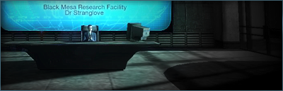
(Oyar, sometimes in FF, dunno about the other browsers but, images won't load. I almost gave Dr. Strangelove a 2/10 for his avvie because it didn't load. I refreshed and...voila. But for Silence...I see nothing, too.)
(Oyar, sometimes in FF, dunno about the other browsers but, images won't load. I almost gave Dr. Strangelove a 2/10 for his avvie because it didn't load. I refreshed and...voila. But for Silence...I see nothing, too.)
#2092
-
- Project Team
-
- 2501 posts
Human Being number 80446219302
Posted 06 May 2009 - 21:20
7/10
A colour scheme is present, and a good way to sum yourself up in a sig, but it loses points where the render cut is feathered at points and well cut with a shadow at other points, it doesn't add to contiunuity at all. The other minor problem was the sig cuttong off some of the (hair?) thing protruding from the end of the hilt.
A colour scheme is present, and a good way to sum yourself up in a sig, but it loses points where the render cut is feathered at points and well cut with a shadow at other points, it doesn't add to contiunuity at all. The other minor problem was the sig cuttong off some of the (hair?) thing protruding from the end of the hilt.

#2093
-
- Administrator
-
- 5853 posts
Whispery Wizard
Posted 06 May 2009 - 21:36
8/10
Its a cool sig, the only thing i think lets it down is the original mistyness of the render. The big ass claws look awesome.
Its a cool sig, the only thing i think lets it down is the original mistyness of the render. The big ass claws look awesome.
F O R T H E N S
#2094
-
- Project Team
-
- 7683 posts
Eternal Glow
Posted 06 May 2009 - 23:02
That sig just looks plane awesome.

#2095
-
- Gold Member
-
- 5630 posts
DO IT MAGGOT
-
Projects: SWR Productions
Posted 06 May 2009 - 23:17
8/10 Like 'em. =)
SWR Co-Lead | Texture Artist | Modeler | Level Designer | Fan of all things Awesome
#2096
-
- Gold Member
-
- 4950 posts
Light up life.
Posted 06 May 2009 - 23:51
Nice sig, classy, and totally fitting 
For there can be no death without life.
#2097
-
- Project Team
-
- 1261 posts
Abdomen and some dried fish.
-
Projects: Frontlines and European Conflict
Posted 06 May 2009 - 23:57
8.4/10
I think I can see my house from here
I think I can see my house from here
Formerly Sobek
#2098
-
- Member Test
-
- 3141 posts
Forum Nakadashi-er
Posted 07 May 2009 - 06:37
7/10 Reminds me WWII...no, not Saving Private Ryan, ehehe.
(Oh yea, Nid, I think's its feather or something at the end of the hilt, but the original image was already cut off I don't recall adding any shadows either, must be some blurring. Gonna have to improve it a bit, then.)
(Oh yea, Nid, I think's its feather or something at the end of the hilt, but the original image was already cut off
I don't recall adding any shadows either, must be some blurring. Gonna have to improve it a bit, then.)
#2099
-
- Member
-
- 347 posts
Professional
-
Projects: For the hunt I sharpen my claws.
Posted 07 May 2009 - 10:37
8/10 at least.
#2100
-
- Project Team
-
- 2501 posts
Human Being number 80446219302
Posted 07 May 2009 - 10:49
6/10, Renders seem out of place, Name is hard to make out.

These bits here.
It looks like you have put a drop shadow, or something similar.
Although I prefer those edges over the other ones.
Destiny, on 7 May 2009, 7:37, said:
7/10 Reminds me WWII...no, not Saving Private Ryan, ehehe.
(Oh yea, Nid, I think's its feather or something at the end of the hilt, but the original image was already cut off I don't recall adding any shadows either, must be some blurring. Gonna have to improve it a bit, then.)
(Oh yea, Nid, I think's its feather or something at the end of the hilt, but the original image was already cut off
I don't recall adding any shadows either, must be some blurring. Gonna have to improve it a bit, then.)These bits here.
It looks like you have put a drop shadow, or something similar.
Although I prefer those edges over the other ones.
Edited by Nidmeister, 07 May 2009 - 10:51.
3 user(s) are reading this topic
0 members, 3 guests, 0 anonymous users

