Indeed, there was a lot of clutter. I'm currently using the first one. However I like having those three lines, and it's great incentive to actually
clean my desktop.
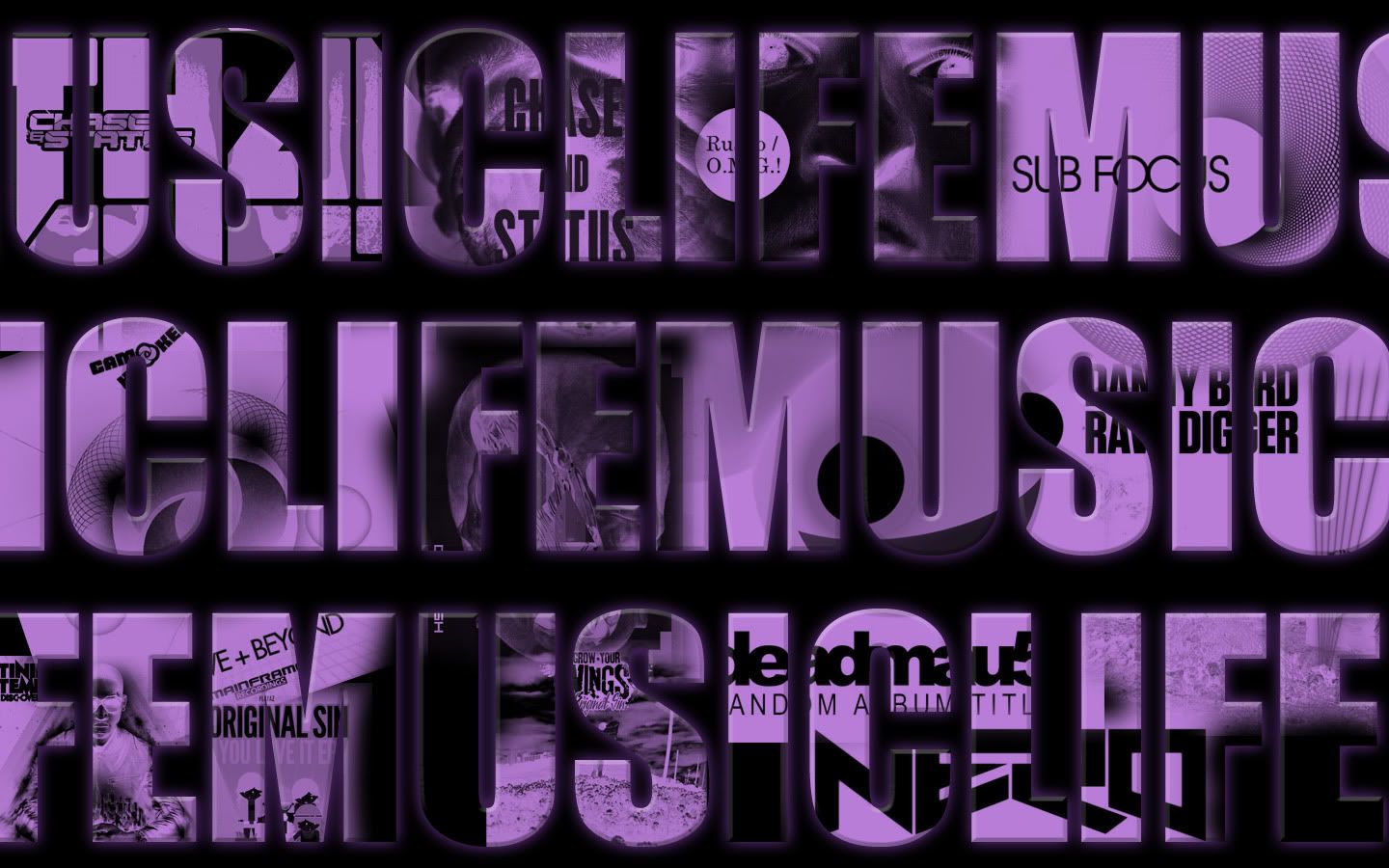
As for the last one, yeah, it's based on entirely the same design, only darker, the reason being I'm not a fan of bright white backgrounds, I never have been, although it's actually grown on me. It was actually initially the original purple shade, however I decided I needed to invert the images behind the text, it didn't stand out enough from the black background. The multiply layer filled with purple I had on as a clipping mask didn't work well though, so I used a brighter shade. I do really enjoy the outcome, but I'm sticking with the original version for now.
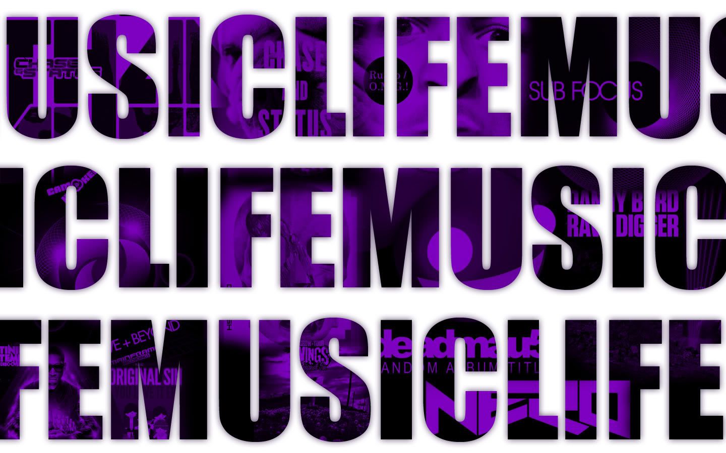
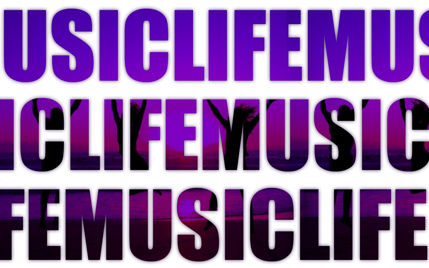
The second one, I used no gradient map actually. The original picture has an orangey glow as it's sunset, reflected by the sea. In the original version with the album art, there is a black hue layer neautralizing the hue of the images beneath it, and a purple mulitply layer on top giving it it's colour. This is why it is, as you say "dull".
I realized this and removed the black layer for the second version, as I quite enjoyed the mix of the orange and purple colours. Sad to hear you don't D:
As for the .gif, it is a crazy circular slap.

Edited by Nid, 25 July 2011 - 22:22.