What's being worked on.
Started By Sgt. Rho, Jun 05 2008 21:36
92 replies to this topic
#76
Posted 23 October 2010 - 07:33
I actually plan to make them bigger, since they have to hold 3 missiles per tube (so 9 on each side, 18 total).
#77
Posted 23 October 2010 - 10:02
Agree with Kaimuk, add some more missile pods. Perhaps 2 more.....
#78
Posted 24 October 2010 - 20:00

oh
nice unit though, i have a weakness for multiple missile pods.
it's time to wake up
#79
Posted 25 October 2010 - 12:12

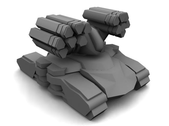
A little 3d eyecandy, prepare for epic eye-pain.
#80
Posted 26 October 2010 - 03:08
Now that looks better  . I guess this is in the firing position. Does the launcher drop down parallel to the ground in idle mode?
#81
Posted 26 October 2010 - 05:10

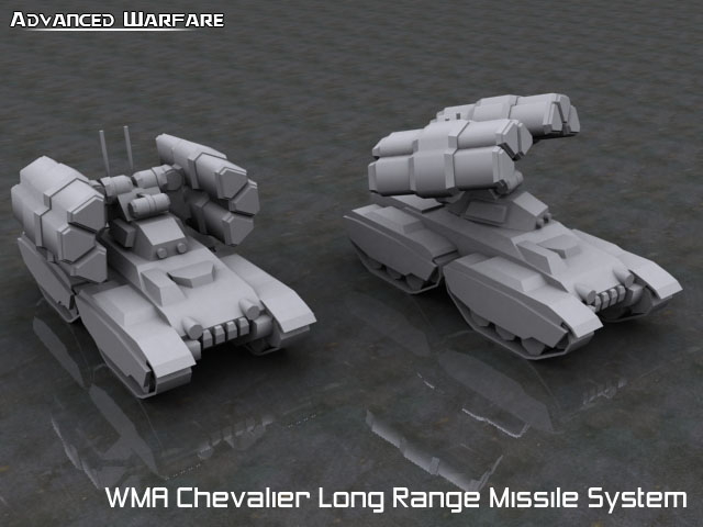
Here you can see it in idle and firing position.
#82
Posted 26 October 2010 - 06:33
That looks epic although in idle mode the top looks a bit blank. I mean in between the 2 launchers. But its not a huge issue I guess. The firing position looks pretty badass.
#84
Posted 27 October 2010 - 10:25
'tad dark but looks sweet...
#85
Posted 27 October 2010 - 10:31
I'm making them dark, because ingame they end up brighter 
#86
Posted 27 October 2010 - 13:45
Ingenious...I feel that there should be more gunmetal grey around the center of the pods.
#89
Posted 27 October 2010 - 16:31
Yeah, I haven't added all that, I usually have a pre-made detail texture for that, but I can't seem to find it >.>
Also the borders will be scratched later on too.
Also the borders will be scratched later on too.
#90
Posted 27 October 2010 - 22:38
They look like plasma guns rather than missile tubes. Lose the blue.
#92
#93
Posted 02 November 2010 - 08:54
IMO the older version of the skin looks better, still the edges could be sharper and less rounded.


Awesome radio
Quote
19:44 - Chyros: I'm very harmless
2 user(s) are reading this topic
0 members, 2 guests, 0 anonymous users


