My new start
#1
Posted 18 August 2008 - 18:02
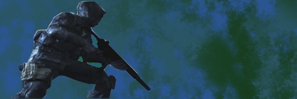
here is my first moage. I did a bad job at cutting. Anyways. I use GIMP. If you have any tips or pointers, please say so.
My personal sig. More to come. :D
#2
Posted 18 August 2008 - 18:07
Do I see extreme use of Render->Cloud filter?
#3
Posted 18 August 2008 - 18:08
i really am just learning. I love it. I need to get better at cutting though. And the use of layers too! Amongst MANY other things. I am scratching the surface.
Edited by Carnage18, 18 August 2008 - 18:10.

My personal sig. More to come. :D
#5
Posted 18 August 2008 - 21:55
Call of Duty 4.
My personal sig. More to come. :D
#6
Posted 18 August 2008 - 22:15
But not bad, keep it up! Just add a border it'll look better then.
#7
Posted 18 August 2008 - 22:23
My personal sig. More to come. :D
#8
Posted 18 August 2008 - 22:25
#9
Posted 18 August 2008 - 22:46
#11
Posted 18 August 2008 - 23:03
#12
Posted 19 August 2008 - 04:26
Here is my first Photoshop image. Please leave a comment.
My personal sig. More to come. :D
#14
Posted 19 August 2008 - 11:16
#15
Posted 19 August 2008 - 13:14
the hardest part is to avoid using those. or at least to combine them to something original.
#16
Posted 19 August 2008 - 15:01
Carnage18, on 19 Aug 2008, 5:26, said:
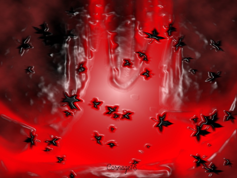
Here is my first Photoshop image. Please leave a comment.
that actually really looks good
keep it up and youll get better really fast, check youtube/google for tutorials as well
#17
Posted 19 August 2008 - 16:14
Heres my "Sig of the Week" entry. If ya want it, just ask.
Edited by Thunderstruck, 21 August 2008 - 16:56.
My personal sig. More to come. :D
#19
Posted 21 August 2008 - 17:08
My personal sig. More to come. :D
#21
Posted 21 August 2008 - 17:14
My personal sig. More to come. :D
#22
Posted 21 August 2008 - 18:56
Here's a tip: When you use renders and put them in front of a background, it looks nicer if the background - atleast the part around the actual render - has similar colours. That way, the render blends into the background more nicely. One thing that is REALLY important is using a decent render. Try planetrenders.net, there are plenty of high quality cuts from various games. One thing you should avoid is using a small render and making it bigger. That way, you'll lose quality and the result can ruin an otherwise decent signature. Also, when you have a screenshot that includes your render, try using the rest of the pic as part of your signature instead of cutting out a single object. It allows for some interesting effects.
Edited by Rayburn, 21 August 2008 - 18:59.
#23
Posted 21 August 2008 - 18:59
My personal sig. More to come. :D
#24
Posted 21 August 2008 - 19:06
Edited by Rayburn, 21 August 2008 - 19:07.
#25
Posted 21 August 2008 - 19:07
My personal sig. More to come. :D
1 user(s) are reading this topic
0 members, 1 guests, 0 anonymous users