Jump to content


My Art


130 replies to this topic

#26 AZZKIKR

    I am sarcastic and evil

  • Project Leader
  • 2215 posts
  • Projects: beta tester of world at war cnc and situation zero concept art

Posted 02 April 2009 - 08:16

the 2 "cannons" are funnels that cause a corrosive foam to gush out. foam is contained in containers.
Posted Image
Posted Image
RIP CommanderJB

#27 AZZKIKR

    I am sarcastic and evil

  • Project Leader
  • 2215 posts
  • Projects: beta tester of world at war cnc and situation zero concept art

Posted 25 April 2009 - 13:28

double post.

Posted Image

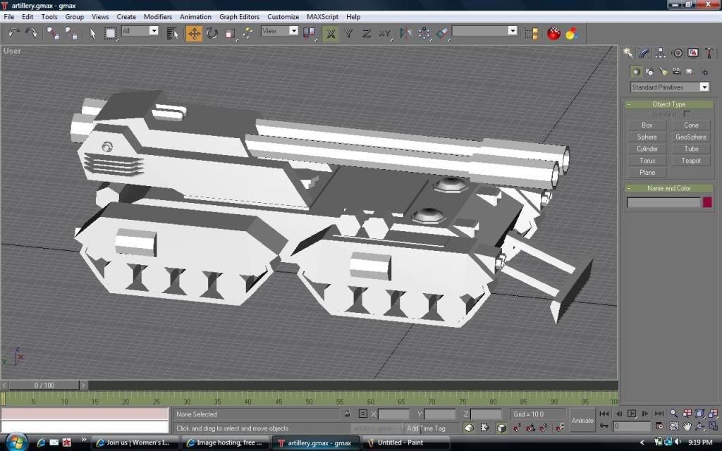
something i made to replace the olga which i deemed do not fit

it is armed with 2 203mm guns
Posted Image
Posted Image
RIP CommanderJB

#28 AZZKIKR

    I am sarcastic and evil

  • Project Leader
  • 2215 posts
  • Projects: beta tester of world at war cnc and situation zero concept art

Posted 04 May 2009 - 11:34

triple post!

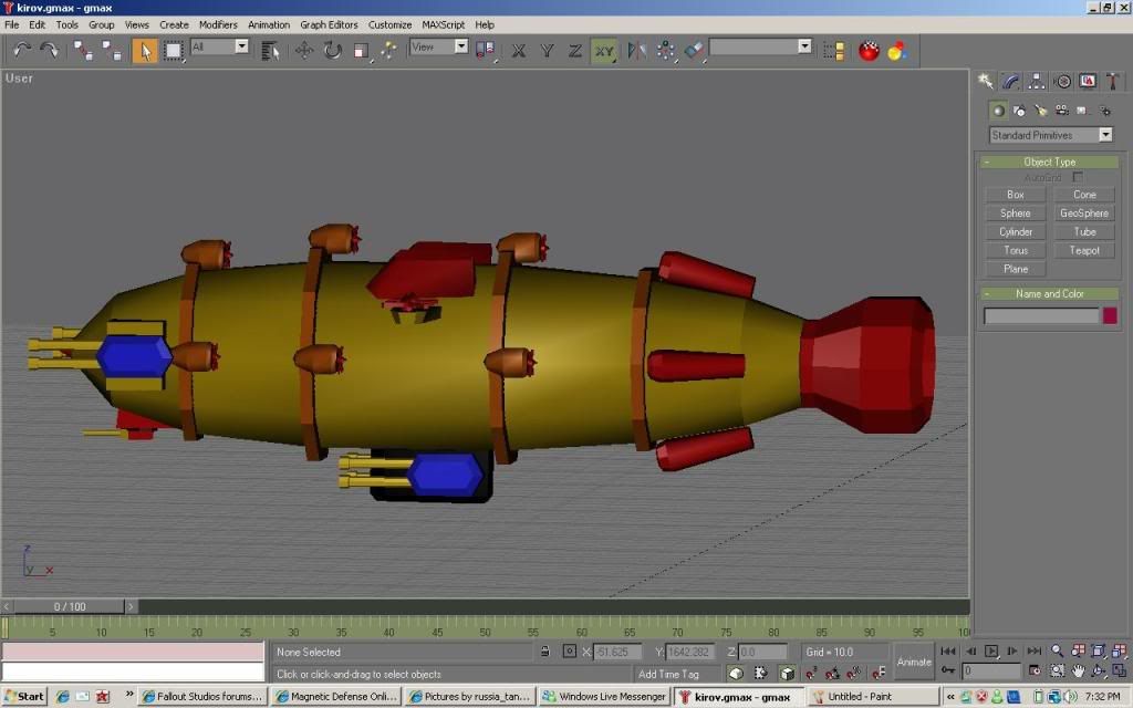
my first aircraft model. the kirov gunship!

Posted Image

Comments please
Posted Image
Posted Image
RIP CommanderJB

#29 Wizard

    [...beep...]

  • Administrator
  • 9627 posts

Posted 05 May 2009 - 08:38

Would be nice to see it from an angle that isn't profile. But it looks ok if a tiny bit on the long side. Perhaps make it a touch more bulbous than slender.

#30 Alias

    Member Title Goes Here

  • Member
  • 11705 posts

Posted 05 May 2009 - 08:46

The cannon turrets need to be way rounder, it looks like it'll collide into the balloon if it rotates too far.
You may also want to add tail fins.

Posted Image

#31 AZZKIKR

    I am sarcastic and evil

  • Project Leader
  • 2215 posts
  • Projects: beta tester of world at war cnc and situation zero concept art

Posted 06 May 2009 - 13:29

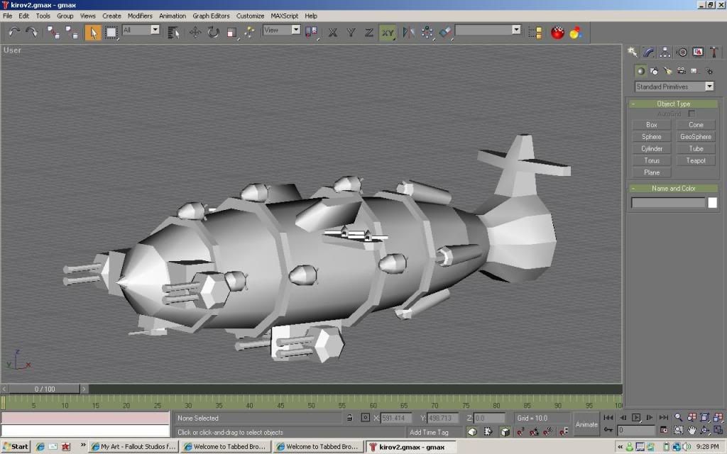
Thanks for the comments. here
Posted Image

better?
Posted Image
Posted Image
RIP CommanderJB

#32 Wizard

    [...beep...]

  • Administrator
  • 9627 posts

Posted 06 May 2009 - 13:36

WHOA JESAS!!!

That is one hella busy looking model you have there. Is it supposed to be an elongated Death Star? I'd suggest removing some turrets/guns, get rid of the supports (leave it to the skin) and generally make it a but plainer. It is way to cluttered right now and looks like a lumpy balloon animal more than an airship.

Edited by Wizard, 06 May 2009 - 13:36.


#33 AZZKIKR

    I am sarcastic and evil

  • Project Leader
  • 2215 posts
  • Projects: beta tester of world at war cnc and situation zero concept art

Posted 06 May 2009 - 14:43

ok then. but i can't skin unfortunately, if anyone were to help?

anyone?
Posted Image
Posted Image
RIP CommanderJB

#34 BeefJeRKy

    Formerly known as Scopejim

  • Gold Member
  • 5114 posts
  • Projects: Life

Posted 06 May 2009 - 16:42

As Wiz said, it looks quite cluttered. Move those front cannons to where the bottom and make it a double tri-cannon config (i.e. 6 cannons total). Get rid of some of the props too. Finally, the tail needs a fix. Looks horribly out of place. The model has potential though.
Posted Image

#35 Camille

    girl eater

  • Project Team
  • 2351 posts

Posted 06 May 2009 - 20:41

get some nicer renders :read:

(already posted that but that post miraculously vanquished...)
it's time to wake up

#36 WNxMastrefubu

    Man, myth, and legend

  • Member
  • 1136 posts
  • Projects: diji

Posted 06 May 2009 - 21:27

View PostPrawn, on 6 May 2009, 16:41, said:

get some nicer renders :read:

(already posted that but that post miraculously vanquished...)

u mean vanished im sure
Attached Image: bob.jpg

#37 Camille

    girl eater

  • Project Team
  • 2351 posts

Posted 07 May 2009 - 07:54

View PostWNxMastrefubu, on 6 May 2009, 21:27, said:

View PostPrawn, on 6 May 2009, 16:41, said:

get some nicer renders :read:

(already posted that but that post miraculously vanquished...)

u mean vanished im sure


yes i did, my bad.
it's time to wake up

#38 Dauth

    <Custom title available>

  • Gold Member
  • 11193 posts

Posted 07 May 2009 - 07:57

I don't see any real need for the tail, Zeppelins turn due to the fans and float with the helium and lift props.

Removing some of the guns and perhaps doing a little more with the understructure, antenna or something to communicate with the ground etc.

#39 AZZKIKR

    I am sarcastic and evil

  • Project Leader
  • 2215 posts
  • Projects: beta tester of world at war cnc and situation zero concept art

Posted 07 May 2009 - 08:49

i can't render with gmax. plus render suite seems to have a problem, must be due to my vista
Posted Image
Posted Image
RIP CommanderJB

#40 AZZKIKR

    I am sarcastic and evil

  • Project Leader
  • 2215 posts
  • Projects: beta tester of world at war cnc and situation zero concept art

Posted 08 May 2009 - 13:46

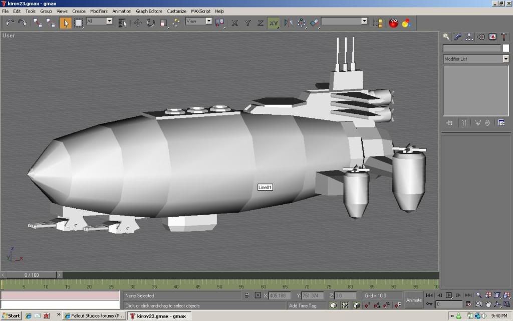
redone
Posted Image
Posted Image
Posted Image
RIP CommanderJB

#41 Dauth

    <Custom title available>

  • Gold Member
  • 11193 posts

Posted 08 May 2009 - 15:08

Significant improvement, not perfect yet but a lot better.

I'd add some sort of lift prop on the front third or the stress will buckle any chassis you care to name. The helipad on top is a nice touch.

#42 pirate

    The friendly scourge of the seven seas

  • Project Leader
  • 1256 posts
  • Projects: GenerationX, Forgotten Fury, European Conflict and more

Posted 08 May 2009 - 17:59

that looks a lot better :D, I mean a helideck on a zeppelin, dude, what else can you want :D
Proud leader of Forgotten Fury and co-leader of European Conflict

Posted Image
Posted Image
Posted Image
Posted Image

#43 BeefJeRKy

    Formerly known as Scopejim

  • Gold Member
  • 5114 posts
  • Projects: Life

Posted 08 May 2009 - 19:10

View PostAZZKIKR, on 8 May 2009, 9:46, said:

redone
Posted Image

Ah now THAT is NICE! As Dauth said, move some lift props to the middle at least. And now the tail looks well proportioned too. Overall great job! :D
Posted Image

#44 pirate

    The friendly scourge of the seven seas

  • Project Leader
  • 1256 posts
  • Projects: GenerationX, Forgotten Fury, European Conflict and more

Posted 08 May 2009 - 22:25

I would suggest keeping those props at the back as they are, adding new ones a bit more to the front would be better I think :D
Proud leader of Forgotten Fury and co-leader of European Conflict

Posted Image
Posted Image
Posted Image
Posted Image

#45 AZZKIKR

    I am sarcastic and evil

  • Project Leader
  • 2215 posts
  • Projects: beta tester of world at war cnc and situation zero concept art

Posted 09 May 2009 - 01:14

Lift propS? can't seem to find them on google. and model was based on RA2 concept

http://www.cnc-source.com/forums/index.php...si&img=5939
Posted Image
Posted Image
RIP CommanderJB

#46 Lord Atlantis

    I am Iron Man

  • Member
  • 3807 posts

Posted 09 May 2009 - 05:14

Propellors. Put some propellors in the front or middle instead of just keeping them in the back.
Posted Image

#47 AZZKIKR

    I am sarcastic and evil

  • Project Leader
  • 2215 posts
  • Projects: beta tester of world at war cnc and situation zero concept art

Posted 09 May 2009 - 09:19

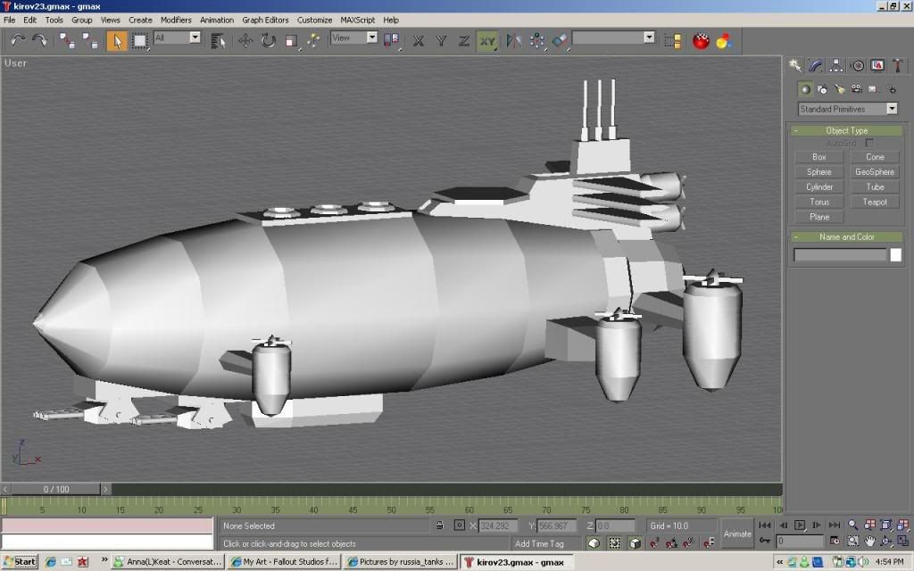
Posted Image

ok?
Posted Image
Posted Image
RIP CommanderJB

#48 Dauth

    <Custom title available>

  • Gold Member
  • 11193 posts

Posted 09 May 2009 - 10:13

Make them a little bigger and I think you have a winner. You could also extend the box underneath the main balloon back a bit.

#49 AZZKIKR

    I am sarcastic and evil

  • Project Leader
  • 2215 posts
  • Projects: beta tester of world at war cnc and situation zero concept art

Posted 10 May 2009 - 08:56

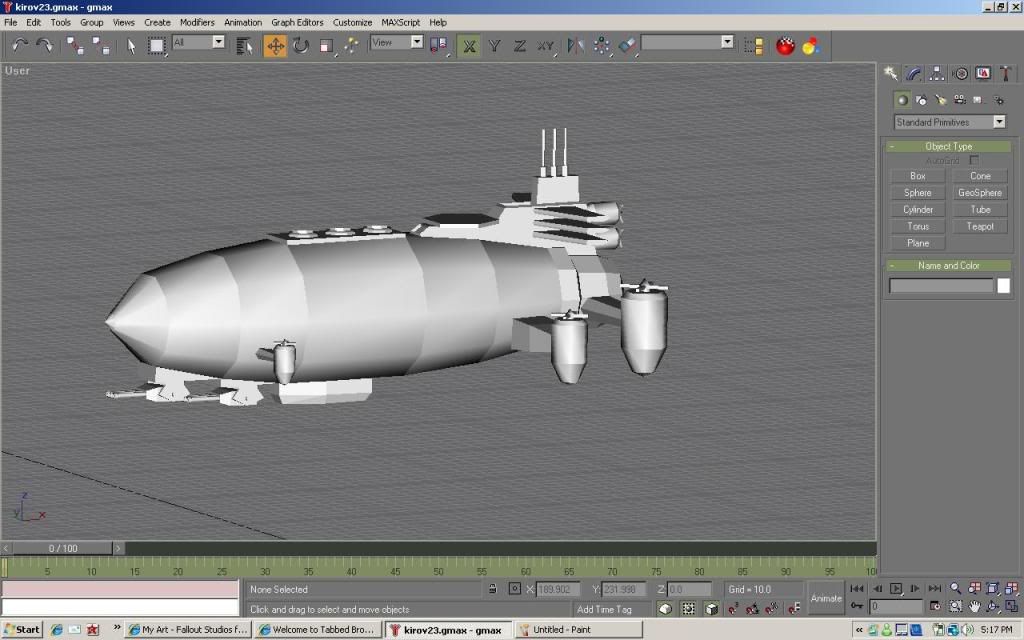
Posted Image

better?
Posted Image
Posted Image
RIP CommanderJB

#50 Dauth

    <Custom title available>

  • Gold Member
  • 11193 posts

Posted 10 May 2009 - 09:27

Much. I like is a lot now. Well done mate.


5 user(s) are reading this topic

0 members, 5 guests, 0 anonymous users