Jump to content


Aarons Zone


98 replies to this topic

#76 Zhao

    That pro guy.

  • Project Team
  • 619 posts
  • Projects: Situation Zero

Posted 16 June 2010 - 09:15

Posted Image

after a massive 13 hours trying to figure out how to rig zero hour models i evidently did
You do not need renx or blah blah else eaither you just need 3dsmax 8.

- Can anybody tell me how i can make this background/cameo look better |8?

#77 Zeke

    The X General

  • Project Team
  • 3504 posts
  • Projects: Deep Impact (formerly EC)

Posted 16 June 2010 - 11:18

Importing a w3d model removes all of it's settings.

You need to re-apply them before you export it.

For the tread texture, go to the 'Vertex Material' tab and under 'Stage 0 Mapping' change 'UV' to 'Linear Offset' and set the 'UPerSec=0.0' to 'UPerSec=-2.0' (the value doesn't really matter as long as it's not zero, ingame it will follow the 'TreadAnimationRate' in the vehicle's code).

For muzzle flashes, go to 'Vertex Material' and make the 'Emissive' color white, then in the shader tab, change the blend mode to 'Add'. After that go to 'W3d Tools' and check the '2 Sided' checkbox under 'Geometry Options'

EDIT: You only need RenX if you use Gmax, and IIRC you need the BFME II ModSDK to export stuff to Generals with 3ds max, though I'm not sure with 8.

About your cameo question, you need to make the terrain texture smaller, and zoom in to the tank more, A LOT more |8

Edited by Zeke, 16 June 2010 - 11:24.


#78 Zhao

    That pro guy.

  • Project Team
  • 619 posts
  • Projects: Situation Zero

Posted 17 June 2010 - 05:37

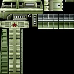
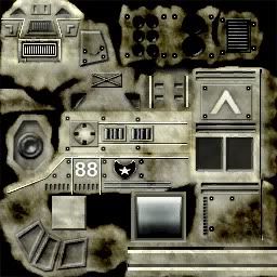
Both of these textures have something in common .. There skins for units.... Custom units created by Indie Skinners/modelers.
Posted Image Posted Image


My question is how do skinners keep the factions "Theme" along with the unit there creating.
i don't see it being possible to "Create" yet in most mods i play there really consistent. how do people do that
(And yes i always Google these things 8|)

#79 Pav:3d

    YOUR WORLDS WILL BECOME OUR LABORATORIES

  • Project Leader
  • 7224 posts
  • Projects: EC, CORE, ER

Posted 17 June 2010 - 08:37

Copy and paste different traits, colours and recurring patterns from other skins.

Posted Image

Posted Image

#80 Zhao

    That pro guy.

  • Project Team
  • 619 posts
  • Projects: Situation Zero

Posted 17 June 2010 - 09:29

Posted Image

How do i make it look better then that , the best i could think of for it to fit the UVM was to stretch it and now it looks bad D:

#81 Pav:3d

    YOUR WORLDS WILL BECOME OUR LABORATORIES

  • Project Leader
  • 7224 posts
  • Projects: EC, CORE, ER

Posted 17 June 2010 - 09:30

Through trial and error. You've really gotta study skins if you want to do them in a similar style.
Also it would be best to start off with a base colour (IE, that olive green that China uses)

Posted Image

Posted Image

#82 Alias

    Member Title Goes Here

  • Member
  • 11705 posts

Posted 17 June 2010 - 09:49

Base textures really help.

When I was working on Rise of the Reds every faction had a unit base texture that was the same on every unit, and you just build up dodge and burn from there, and as Pav3d said, there is recurring traits that are reused on units. A texture I did for a certain type of truck (that is incidentally, still not implemented) has elements that are reused in other truck-based units.

Posted Image

#83 Zhao

    That pro guy.

  • Project Team
  • 619 posts
  • Projects: Situation Zero

Posted 20 June 2010 - 03:28

http://www.youtube.c...h?v=mIXixEIT6-M

why is it shooting from the middle of the model , the code seems fine ;_;

EDIT:

More specfically

-The new bullet render is showing , however the default bullet thing is as well.
-the bullet is appearing in the middle of no where in the model :xD:

Edited by Aaron, 20 June 2010 - 04:10.


#84 Pav:3d

    YOUR WORLDS WILL BECOME OUR LABORATORIES

  • Project Leader
  • 7224 posts
  • Projects: EC, CORE, ER

Posted 20 June 2010 - 09:48

Its to do with the "boning" of the model, importing and re-exporting messed the bone up

Posted Image

Posted Image

#85 Zhao

    That pro guy.

  • Project Team
  • 619 posts
  • Projects: Situation Zero

Posted 21 June 2010 - 01:29

I tried working on 3dsmax today and i don't know exactly caused it but when i go to rotate/move/etc a object that "XYZ" Thing that makes it easy is no longer there , so when i try to move the object is 100x harder because tis not showing ... It looks something like this

Posted Image

that circlur rotate thing is not showing for rotate , and the other icon is not showing for move etc etc.

#86 CJ

    Rocket soldier

  • Member Test
  • 2150 posts
  • Projects: Nothing yet

Posted 21 June 2010 - 10:40

That 'thing' is called a Transformation Gizmo, now I can't tell you exactly where to find it in the English version, but I think it must be in some Menu called View, anyway you've gotta search for Transformation Gizmo in the menus and check it...

View PostChyros, on 11 November 2013 - 18:21, said:

I bet I could program an internet


#87 Pav:3d

    YOUR WORLDS WILL BECOME OUR LABORATORIES

  • Project Leader
  • 7224 posts
  • Projects: EC, CORE, ER

Posted 21 June 2010 - 13:35

Press "x" to bring up the gizmo

Posted Image

Posted Image

#88 Generalcamo

    Casual

  • Member
  • 78 posts
  • Projects: None

Posted 21 June 2010 - 16:30

That looks nice, all you need to do is smooth the edges, and texture it.
Supporter of Stalin

#89 Zhao

    That pro guy.

  • Project Team
  • 619 posts
  • Projects: Situation Zero

Posted 25 July 2010 - 08:32

new sig
Posted Image

Not to high quality but , i was trying to make the render pop out on the signature , Created with 3dsmax + photoshop.

#90 TheDR

    Whispery Wizard

  • Administrator
  • 5852 posts

Posted 25 July 2010 - 08:44

Apart from the fact the text is a bit hard to read, it looks cool 8|

Nice work.
Posted Image
F O R T H E N S
Posted Image

#91 Zhao

    That pro guy.

  • Project Team
  • 619 posts
  • Projects: Situation Zero

Posted 11 October 2010 - 20:32

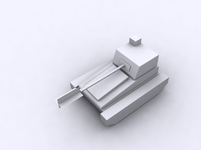
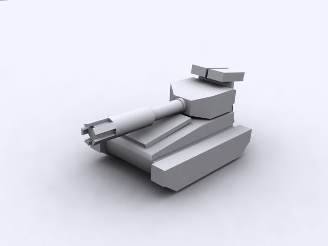
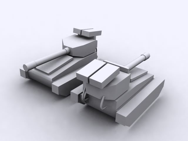
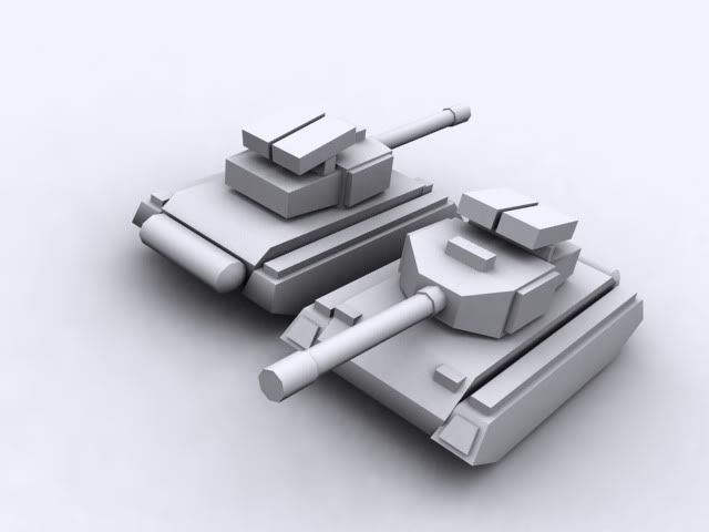
I have bein working on a tank again. (Wow that's not totally redundant)

Posted Image

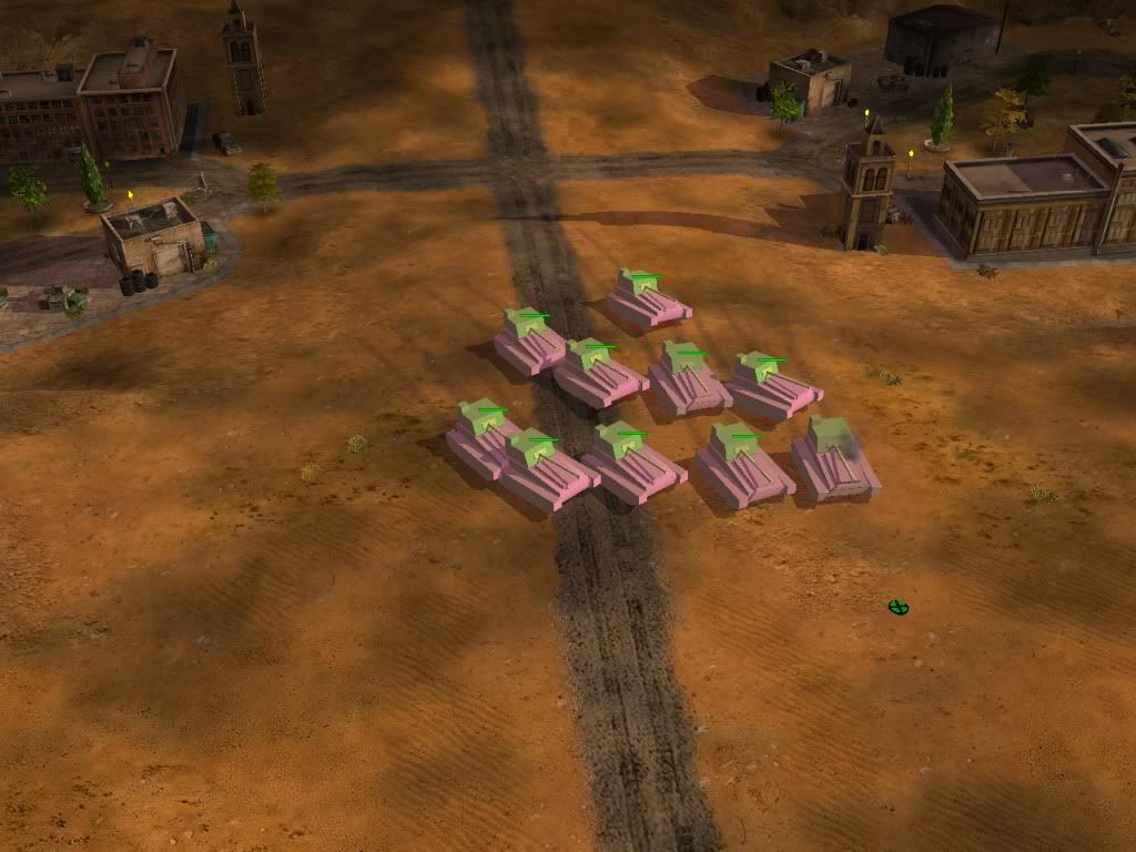
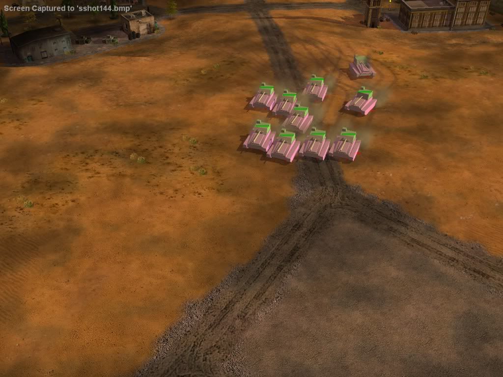
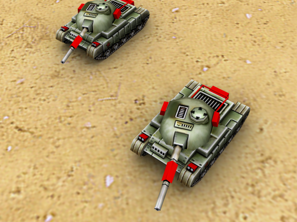
And here are some in game shots (Sorry most of that is color coded to help with other things)


Posted Image
Posted Image

Any suggestions , criticism will be appreciated :D!

Edited by Aaron, 11 October 2010 - 20:33.


#92 colonelc

    Newbie

  • Member
  • 1 posts

Posted 11 October 2010 - 21:02

seems good so far, but it seems a bit boxy though

#93 Wizard

    [...beep...]

  • Administrator
  • 9627 posts

Posted 11 October 2010 - 21:05

Did you base this on a blue print?

#94 Zhao

    That pro guy.

  • Project Team
  • 619 posts
  • Projects: Situation Zero

Posted 11 October 2010 - 21:06

View PostWizard, on 11 Oct 2010, 21:05, said:

Did you base this on a blue print?


Yes

#95 Pav:3d

    YOUR WORLDS WILL BECOME OUR LABORATORIES

  • Project Leader
  • 7224 posts
  • Projects: EC, CORE, ER

Posted 11 October 2010 - 21:28

View PostAaron, on 11 Oct 2010, 22:06, said:

View PostWizard, on 11 Oct 2010, 21:05, said:

Did you base this on a blue print?


Yes

A Blueprint of what?
It needs a hell of a lot of more detail (And RELEVANT detail, something like that random box on the top of the main chassis looks out of place, and the very slim box infront of the barrel) , and needs to be far less boxy.

Posted Image

Posted Image

#96 Zhao

    That pro guy.

  • Project Team
  • 619 posts
  • Projects: Situation Zero

Posted 11 October 2010 - 23:36

Posted Image


Any better? more suggestions :P?

Went along ahead by colonel Cs advice and changed the turret to something less odd (and generic)

Posted Image

Now criticize 8)

Edited by Aaron, 12 October 2010 - 00:22.


#97 Zhao

    That pro guy.

  • Project Team
  • 619 posts
  • Projects: Situation Zero

Posted 12 October 2010 - 02:28

BAM.

Posted Image

2+ hours of work and i got this.
suggestions?

Edited by Aaron, 12 October 2010 - 02:30.


#98 BeefJeRKy

    Formerly known as Scopejim

  • Gold Member
  • 5114 posts
  • Projects: Life

Posted 12 October 2010 - 06:08

Evolving nicely I'd say
Posted Image

#99 Wizard

    [...beep...]

  • Administrator
  • 9627 posts

Posted 12 October 2010 - 08:11

Well to start with, the first model was pretty poor (sorry), not saying I can do better or anything, but it resembled several rectangular boxes stuck together with no real representation to any tank that would work. However, your subsequent models show real and considerable improvement. The last one especially is a huge improvement, both in terms of style, but also of proportions. The barrel is far to high poly for what you'd use in ZH (knowing you I assume this is destined for ZH :P ). As you can see from the screenies of the first tank, making a cyclinder doesn't do anything in game but look thin and very breakable. You could try and make the tread cover less angled as they don't appear flush to the hull.

Good improvements :xD:

Edited by Wizard, 12 October 2010 - 08:11.


20 user(s) are reading this topic

0 members, 20 guests, 0 anonymous users