10/10 , make that your sig rightaway.

No-Skillz' Crap Showcase (v2)
Started By Nexolate, May 13 2006 09:11
578 replies to this topic
#276
-
- Project Team
-

- 5507 posts
Veteran
-
Projects: NLS 2D Artist, Code 13 Cameo Artist
Posted 06 October 2006 - 21:37


#277
-
- Global Moderator
-

- 13457 posts
Greenskin Inside
-
Projects: Shoot. Chop. Smash. Stomp.
Posted 07 October 2006 - 01:33
9/10 I don't know what it's missing, but your current sig should stay. Maybe you could use that as a basis for a new avvy or something.
My best,
Major Nuker
My best,
Major Nuker

#278
-
- Member
-

- 3831 posts
we dont need i to c
Posted 08 October 2006 - 14:17
6/10. the white looks ugly next to the rest and it lacks direction. The border is flimsy and the stuff to the right just looks like it comes out of nowhere.
Definitively not up to your standard, considering the kickassness of your current sniper sig.
Definitively not up to your standard, considering the kickassness of your current sniper sig.
Edited by Cycerin, 08 October 2006 - 14:18.
Lifes a shit.. deal w/ it..its impossible to have a good day wow fuck this gay earth much??

Ask me questions about audio technical matters or DAWs!
Ask me questions about audio technical matters or DAWs!
#279
-
- Member
-
- 3078 posts
The Hated
Posted 08 October 2006 - 14:58
The white is meant to be transparent, your Browser is just unable to comprehend that.
Try opening the link directly, that way you get more of an idea of how transparent it really is.
And it's meant to come out of nowhere.
I couldn't fuse it into a Tech Border because I was trying a mixture of a Fade-Out and Line Borders (again, see Direct Link for an idea).
Is there anything else?
EDIT: Just curious here; did that "White-ness" you see influence your vote in SOTW?
EDIT2: That also means you're seeing a whiteness on the corner of my current sig and the Scope is less transparent than it should be.
Edited by No-Skillz, 08 October 2006 - 15:03.

You'll only notice me when it's too late.

#280
-
- Member
-
- 3831 posts
we dont need i to c
Posted 08 October 2006 - 19:53
I was using a computer with IE6 when I wrote that post, so I didn't see the white as transparency. Now that I can see how it really is, i'll raise my score to 7/10. I still think it lacks detail, and no matter how intential the "out of nowhere-ness" is meant to be, it still doesn't look good. The border looks better now that it's hanging halfway out of the sig rather than being engulfed in white, though.
Lifes a shit.. deal w/ it..its impossible to have a good day wow fuck this gay earth much??
Ask me questions about audio technical matters or DAWs!
Ask me questions about audio technical matters or DAWs!
#281
-
- Member
-
- 3078 posts
The Hated
Posted 08 October 2006 - 19:59
Well, that's good.
I suppose not everyone will like a different style. ^_^
What to do next? I was thinking of doing a BF2142 Version of my current sig, all Tundra; white and silver.
I suppose not everyone will like a different style. ^_^
What to do next? I was thinking of doing a BF2142 Version of my current sig, all Tundra; white and silver.
You'll only notice me when it's too late.
#282
-
- Member
-
- 3078 posts
The Hated
Posted 21 October 2006 - 04:50
With the arrival of the SOTW#22 Voting, I feel there's no harm now in posting this.

-Thoughts?
-Ratings out of 10?
-Thoughts?
-Ratings out of 10?
You'll only notice me when it's too late.
#283
-
- Member
-
- 11705 posts
Member Title Goes Here
Posted 21 October 2006 - 04:57
Other than it need colour, it looks fine.
8/10
2 points for border (of 2)
2 points for effects (of 2)
2 points for look-goodness (of 2)
1 point for eyecatchingness (of 2)
1 point for colour (or 2)
If you had some colour to the render, you would've been bordering on 10.
8/10
2 points for border (of 2)
2 points for effects (of 2)
2 points for look-goodness (of 2)
1 point for eyecatchingness (of 2)
1 point for colour (or 2)
If you had some colour to the render, you would've been bordering on 10.
Edited by The Grue, 21 October 2006 - 04:59.

#284
-
- Member
-
- 3078 posts
The Hated
Posted 21 October 2006 - 05:04
The Grue, on 21 Oct 2006, 05:57, said:
2 points for look-goodness (of 2)
1 point for eyecatchingness (of 2)
1 point for eyecatchingness (of 2)
Lol. Is that even possible? xD
Seriously though, BF2142 is set in a time where the Snow and Tundra have covered the planet.
It's lucky that I even used Red, let alone more colours.
But thanks for the Comments and Ratings. I suppose Colour is something I have to work on next time.
Edited by No-Skillz, 21 October 2006 - 05:04.
You'll only notice me when it's too late.
#285
-
- Global Moderator
-
- 13457 posts
Greenskin Inside
-
Projects: Shoot. Chop. Smash. Stomp.
Posted 21 October 2006 - 05:26
I give it a 9 out of 10, since for me, color has to be needed, and color isn't really needed for this sig. IMHO it looks fine without a lot of color. Good work No-Skillz.
My best,
Nuker
My best,
Nuker
#286
-
- Project Team
-
- 5507 posts
Veteran
-
Projects: NLS 2D Artist, Code 13 Cameo Artist
Posted 21 October 2006 - 07:44
10/10, I love it.
#287
-
- Member
-
- 3078 posts
The Hated
Posted 21 October 2006 - 07:48
=D
Thanks you guys, you're really like the icing on my day.
(BF2142 just came in the post, I'm just installing. )
)
Thanks you guys, you're really like the icing on my day.
(BF2142 just came in the post, I'm just installing.
)
You'll only notice me when it's too late.
#288
-
- Global Moderator
-
- 13457 posts
Greenskin Inside
-
Projects: Shoot. Chop. Smash. Stomp.
Posted 23 October 2006 - 06:41
No-Skillz, here's an idea (should you need it) for your next sig. Yoshimitsu, from Tekken 5. Either him sitting Indian style, "the Flea", or any other pose you can find or cook up. The border could be the outline of a dojo or something Japanese.
Regards,
Major Nuker
Regards,
Major Nuker
#289
-
- Member
-
- 3078 posts
The Hated
Posted 23 October 2006 - 09:54
Hmm, that's an interesting idea.
Not sure about the Dojo-Shaped Border, but the rest is good.
Problem is, finding Yoshimitsu doing anything aside from Standing or Running is kinda hard. =/
Not sure about the Dojo-Shaped Border, but the rest is good.
Problem is, finding Yoshimitsu doing anything aside from Standing or Running is kinda hard. =/
You'll only notice me when it's too late.
#290
-
- Global Moderator
-
- 13457 posts
Greenskin Inside
-
Projects: Shoot. Chop. Smash. Stomp.
Posted 23 October 2006 - 21:51
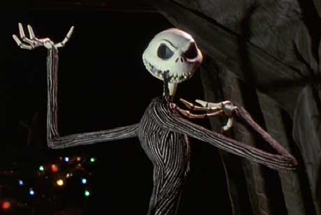
Good point, but the idea is still there just in case. I have another idea for you, and I guess you could consider this a request. I'd like this, seeing that Halloween is coming up, and I'd like to do something different.
I was thinking of The Nightmare before Christmas and Jack Skellington. Maybe you could use this as the pic, but if you're able to find a different/better one, maybe you could use that.
Please feel free to take care of other requests (if there are any) before focusing on this one.
Regards,
Major Nuker
P.S. Also, if you could make this into an avvy, I'd appreciate it. And again, do this when you have the time. The border could probably be thin yellow lines, and if you could get the background to be the spiral hill, that would be great. Thanks
#291
-
- Member
-
- 432 posts
Veteran
Posted 23 October 2006 - 21:54
id give it 9/10
i like it
i like it
They will rule
 <awesome sig by Mr. Bob
What ever happened to Bob?
the only place you'll never need to go< my website SIGN THE GUEST BOOK
If there was no tomorrow, would you regret today? Nebula, by Myopia
<awesome sig by Mr. BobWhat ever happened to Bob?
the only place you'll never need to go< my website SIGN THE GUEST BOOK
If there was no tomorrow, would you regret today? Nebula, by Myopia
#292
-
- Member
-
- 3078 posts
The Hated
Posted 24 October 2006 - 04:04
@Major Nuker: Hmm, I'll think on it. I suppose I'll need some ideas for a border and a background before I begin.
@BlackBob: Thanks, I like it too.
@BlackBob: Thanks, I like it too.
You'll only notice me when it's too late.
#293
-
- Global Moderator
-
- 13457 posts
Greenskin Inside
-
Projects: Shoot. Chop. Smash. Stomp.
Posted 24 October 2006 - 04:45
Maybe the gate to Halloweentown could be the sig's border (if it's possible to even do that). I was thinking that for the sig, Jack could be placed where the spiral hill was the background instead of the background in the picture. HOWEVER, I realize that cutting him out would be a lot of work, so if you just want to use the current background because of convenience, that's fine by me. I'd like the signature to say "The Pumpkin King" in the upper left and my name (Major Nuker) in the lower right.
The avvy doesn't need a special border. I'm happy with the standard emboss and bevel or no border at all.
Many thanks,
Nuker
The avvy doesn't need a special border. I'm happy with the standard emboss and bevel or no border at all.
Many thanks,
Nuker
#294
-
- Member
-
- 3078 posts
The Hated
Posted 24 October 2006 - 06:46
Ok, I'll Google all the stuff you mentioned and start tommorow.
Today I want to play BF2142 and rake in opinions on the thing I posted in the Entertainment Section. Muahahahahaha! >=D
Today I want to play BF2142 and rake in opinions on the thing I posted in the Entertainment Section. Muahahahahaha! >=D
Edited by No-Skillz, 24 October 2006 - 06:47.
You'll only notice me when it's too late.
#295
-
- Member
-
- 3078 posts
The Hated
Posted 25 October 2006 - 10:52

Avatar! =D
L5 Riesigs ftw...

-Thoughts?
-Ratings?
EDIT: A Design for Nuker's Avie.

What do you reckon Nuker? Slap "Nuker" in a decimated font on there and leave it at that?
EDIT2: For your sig, I put "Halloweentown" into Google and couldn't find anything that remotely looked like a gate. COuld you maybe look up some stuff you'd like as a background? Or suggest some concept that I could PS together?
Edited by No-Skillz, 25 October 2006 - 11:17.
You'll only notice me when it's too late.
#296
-
- Gold Member
-

- 2672 posts
Embody the Truth
Posted 25 October 2006 - 11:17
Both avvies look good.
Edited by Blaat85, 25 October 2006 - 11:19.
#297
-
- Member
-
- 3831 posts
we dont need i to c
Posted 25 October 2006 - 11:40
Lovin' your new avy.  Colors go well with the CNCRE theme and your sig too.
Colors go well with the CNCRE theme and your sig too.
Lifes a shit.. deal w/ it..its impossible to have a good day wow fuck this gay earth much??
Ask me questions about audio technical matters or DAWs!
Ask me questions about audio technical matters or DAWs!
#298
-
- Member
-
- 3078 posts
The Hated
Posted 25 October 2006 - 11:42
Finally! Something he likes!
Rofl! xD
Rofl! xD
You'll only notice me when it's too late.
#299
-
- Member
-
- 3831 posts
we dont need i to c
Posted 25 October 2006 - 11:51
Hey, I just try to give constructive criticism. Most artists I know like to get something different from OMFG DATS SO SWEEET :o :o posts all the time.
I mean... I do!
I mean... I do!
Edited by Cycerin, 25 October 2006 - 11:52.
Lifes a shit.. deal w/ it..its impossible to have a good day wow fuck this gay earth much??
Ask me questions about audio technical matters or DAWs!
Ask me questions about audio technical matters or DAWs!
#300
-
- Member
-
- 3078 posts
The Hated
Posted 25 October 2006 - 11:53
Lmao, dude, joke. Chill out. =P
You're just one of the people I hate.
Besides, most people praise and give criticism if they like it but feel it needs improvement.
And no, you weren't mistaken. That is a Riesig.
They're so much better looking than their PAC Counterparts. ¬_¬
You're just one of the people I hate.
Besides, most people praise and give criticism if they like it but feel it needs improvement.
And no, you weren't mistaken. That is a Riesig.
They're so much better looking than their PAC Counterparts. ¬_¬
Edited by No-Skillz, 25 October 2006 - 11:55.
You'll only notice me when it's too late.
1 user(s) are reading this topic
0 members, 1 guests, 0 anonymous users

