8/10
Nice color scheme, might need some more shoppy goodness. It relies on the render too much. :o
~V.

Rate teh Siggy!
Started By Baal-Zebub, Mar 16 2006 02:36
2198 replies to this topic
#2151
-
- Member
-

- 390 posts
Professional
-
Projects: Resident Knicker.
Posted 03 August 2009 - 23:46

-Tha' rewf iz awn fiyah-
#2152
-
- Administrator
-

- 5853 posts
Whispery Wizard
Posted 04 August 2009 - 00:01
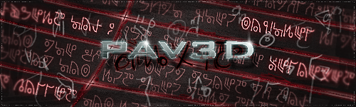
The depth and effects are cool, must of taken a lot of tweaking. Its a bit let down because the main image looks a bit pixelated around the edges, but that might just be because of where its from.
8.8/10
8.8/10

F O R T H E N S

#2153
-
- Member Test
-
- 547 posts
Der Metzgermeister
Posted 04 August 2009 - 11:48
10/10 i love it

my sig showroom kick!!
http://500px.com/schwarzk0pf
glouf, on 23 Jun 2006, 16:51, said:
I like to call him Dr. Spamkopf
#2154
-
- Member
-
- 390 posts
Professional
-
Projects: Resident Knicker.
Posted 04 August 2009 - 23:43
7/10
Ahhh, I love Godzilla!
~V.
Ahhh, I love Godzilla!
~V.
-Tha' rewf iz awn fiyah-
#2156
-
- Gold Member
-

- 4950 posts
Light up life.
Posted 17 August 2009 - 18:57
*Brings back to life*
Good quality, the cut around the edges doesn't look messy enough to be random damage, but doesn't look neat enough to show it's supposed to be there. 8/10
Good quality, the cut around the edges doesn't look messy enough to be random damage, but doesn't look neat enough to show it's supposed to be there. 8/10
For there can be no death without life.
#2157
-
- Project Leader
-

- 7224 posts
YOUR WORLDS WILL BECOME OUR LABORATORIES
-
Projects: EC, CORE, ER
Posted 17 August 2009 - 19:32
Nice, i love the bg, where is it from? (or the brushes u made it with or w/e)

#2158
-
- Member
-
- 5 posts
Newbie
Posted 18 August 2009 - 00:22
Absolutely awesome! I love how the green contrasts with the rest of it. 9/10
#2159
-
- Gold Member
-
- 4950 posts
Light up life.
Posted 18 August 2009 - 00:37
A simple sig, little more than a tweaked screenie tbh. Simple is often effective though - 6/10
For there can be no death without life.
#2160
-
- Member
-
- 5 posts
Newbie
Posted 18 August 2009 - 00:39
lol, mine isn't even tweaked, I just haven't had anyone work on it yet.
As for yours, I'd say 7/10, I like the muted colors and such.
As for yours, I'd say 7/10, I like the muted colors and such.
#2161
-
- Gold Member
-
- 4950 posts
Light up life.
Posted 18 August 2009 - 00:41
The muted colours are there for a reason - there's something about that image that would surprise you 
For there can be no death without life.
#2162
-
- Administrator
-
- 5853 posts
Whispery Wizard
Posted 18 August 2009 - 10:15
I like it, but its a little too big for my preferences. Also, the image in your sig is amazingly overused, but thats not a problem
Also, maybe the render in your avatar could do with a bit of saturation, so it matches the sig.
So i like the overall design, text, placement ect. but its feels like its overly large when it doesn't need to be. 7.5/10
Also, maybe the render in your avatar could do with a bit of saturation, so it matches the sig.
So i like the overall design, text, placement ect. but its feels like its overly large when it doesn't need to be. 7.5/10
F O R T H E N S
#2163
-
- Member Test
-
- 547 posts
Der Metzgermeister
Posted 18 August 2009 - 14:23
97/100
my sig showroom kick!!
http://500px.com/schwarzk0pf
glouf, on 23 Jun 2006, 16:51, said:
I like to call him Dr. Spamkopf


#2165
-
- Gold Member
-
- 4950 posts
Light up life.
Posted 16 September 2009 - 20:29
Not bad, but the image doesn't quite lend itself to that effect, you've lost too much of his head into the BG.
And before anyone says anything: I KNOW IT'S BIG!
And before anyone says anything: I KNOW IT'S BIG!
For there can be no death without life.
#2166
-
- Member Test
-
- 1467 posts
Quick! STAB YOURSELF FOR SAFETY!
Posted 16 September 2009 - 20:47
ITS HUGE
Still though, I think the style and colour suit the render nicely, and the font is nothing but the best for that render and concept.
Its also a little simple, it only being a rectangle coloured with a gradient with a popout.
Still, very nice. I'd say... 9/10
Still though, I think the style and colour suit the render nicely, and the font is nothing but the best for that render and concept.
Its also a little simple, it only being a rectangle coloured with a gradient with a popout.
Still, very nice. I'd say... 9/10
You almost did, didn't you?
#2167
-
- Project Team
-

- 923 posts
Ecchi Toaster
-
Projects: Spam


#2168
-
- Gold Member
-
- 4950 posts
Light up life.
Posted 16 September 2009 - 23:08
Blue/10
I'd give it 7/10 - the hair is too sharply cut off, and the text is too small for me.
I'd give it 7/10 - the hair is too sharply cut off, and the text is too small for me.
For there can be no death without life.
#2169
-
- Member Test
-
- 2150 posts
Rocket soldier
-
Projects: Nothing yet
Posted 16 September 2009 - 23:36
8.88/10
I won't talk about the good sides as that would include almost everything so the bad points are :
- Hair rendering is choppy
- Too big D:
- Text is not well placed, it's too close to the top
I won't talk about the good sides as that would include almost everything so the bad points are :
- Hair rendering is choppy
- Too big D:
- Text is not well placed, it's too close to the top
 Chyros, on 11 November 2013 - 18:21, said:
I bet I could program an internet
#2170
-
- Gold Member
-
- 5114 posts
Formerly known as Scopejim
-
Projects: Life
Posted 16 September 2009 - 23:41
Build sig nao! Right now its a 3/10 for a good quote but no sig image
Right now its a 3/10 for a good quote but no sig image

#2171
-
- Gold Member
-
- 4950 posts
Light up life.
Posted 17 September 2009 - 15:07
8/10
The cut for the bloke was rather epic, but the sig's borders aren't quite right and over/underlap, sadly.
Variation of old sig, hair is sorted, text is lowered now, btw
The cut for the bloke was rather epic, but the sig's borders aren't quite right and over/underlap, sadly.
Variation of old sig, hair is sorted, text is lowered now, btw
For there can be no death without life.
#2172
-
- Administrator
-
- 5853 posts
Whispery Wizard
Posted 17 September 2009 - 16:49
Wait, did you just rate your own sig?
Cut is really nice and overall sig, text, colour ect. are done well.
The only bit i dislike is that the render seems to be slightly faded near the bottom.
7/10, its nice simple sig.
Cut is really nice and overall sig, text, colour ect. are done well.
The only bit i dislike is that the render seems to be slightly faded near the bottom.
7/10, its nice simple sig.
F O R T H E N S
#2174
-
- Gold Member
-
- 4950 posts
Light up life.
Posted 11 October 2009 - 23:24
Nem, on 12 Oct 2009, 0:22, said:
Zomg awesome 8/10
Nice and simple, my kind of sig. Maybe a little too much black on the right, and lack of a name is a little meh, but still ace. 8.5/10
For there can be no death without life.
#2175
-
- Project Team
-
- 4646 posts
IRC is just a multiplayer notepad.
Posted 11 October 2009 - 23:26
9/10 background is a tad bland. Awesome cut though.
Edited by W!, 11 October 2009 - 23:27.

2 user(s) are reading this topic
0 members, 2 guests, 0 anonymous users

