8.5/10 Looks pretty good, although i think it would look better if the "light beams" or what ever you wanna call them in the background were more uniform

Rate teh Siggy!
Started By Baal-Zebub, Mar 16 2006 02:36
2198 replies to this topic
#1902
-
- Gold Member
-

- 4950 posts
Light up life.
Posted 03 July 2008 - 16:19
Maybe a perfectionist could find issue with you current ones - both 9.9/10
For there can be no death without life.
#1904
-
- Administrator
-

- 5853 posts
Whispery Wizard
Posted 08 July 2008 - 07:49
Top one has a good font and border but the main render is hard to see as there is a bit too much light on the sig.
7/10
The bottom one is damn cool and i can't see any faults with it.
9/10
7/10
The bottom one is damn cool and i can't see any faults with it.
9/10

F O R T H E N S

#1905
-
- Member
-

- 211 posts
Semi-Pro
-
Projects: Just Chilling
Posted 08 July 2008 - 08:11
10/10 Just Perfect.
#1907
-
- Gold Member
-
- 4950 posts
Light up life.
Posted 20 July 2008 - 23:21
Meh - and I wonder why you posted here as well..... 
8/10 I really like the stock image used here - it's really neat and I like the look of it a lot, however, i do have issue with the border in that the blending option isn't to my taste, and I feel that it may have been better suited to a gradient from top to bottom red to black, or just all black. That's my only 'issue' as it were with it tho...
8/10 I really like the stock image used here - it's really neat and I like the look of it a lot, however, i do have issue with the border in that the blending option isn't to my taste, and I feel that it may have been better suited to a gradient from top to bottom red to black, or just all black. That's my only 'issue' as it were with it tho...
For there can be no death without life.
#1908
-
- Member
-
- 211 posts
Semi-Pro
-
Projects: Just Chilling
Posted 20 July 2008 - 23:48
9/10 - I think i've already expressed my love for this sig - several times
#1909
-
- Administrator
-
- 9337 posts
Not a Wonky Gent.
Posted 21 July 2008 - 10:54
6.5/10
It's alright, but nothing special
It's alright, but nothing special

F O R T H E N S

#1910
-
- Gold Member
-
- 4950 posts
Light up life.
Posted 21 July 2008 - 20:34
 Bob, on 21 Jul 2008, 11:54, said:
9/10
It's special, but nothing alright
It's special, but nothing alright
Does that make sense for Bob's?
For there can be no death without life.
#1911
-
- Administrator
-
- 5853 posts
Whispery Wizard
Posted 21 July 2008 - 20:45
8/10
Still find the font a bit lacking.
Still find the font a bit lacking.
F O R T H E N S
#1912
-
- Gold Member
-
- 4950 posts
Light up life.
Posted 21 July 2008 - 20:53
10/10 - me too - I'll fix it one day.... yours is simply the best sig I've seen around these parts.......
For there can be no death without life.
#1914
-
- Project Team
-

- 1909 posts
veritas vos liberabit
-
Projects: Hangar 13 Projects
Posted 22 July 2008 - 17:35
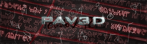
7.5/10. I like it, but it just feels too pink-ish to create the right atmosphere with the nuke...
kinda, sorta alive.
#1916
-
- Project Team
-
- 1909 posts
veritas vos liberabit
-
Projects: Hangar 13 Projects
Posted 22 July 2008 - 20:23
Much better! 9/10. Nao rate mine xD
kinda, sorta alive.
#1917
-
- Project Team
-
- 7683 posts
Eternal Glow
Posted 22 July 2008 - 20:51
8.6/10 'bit crowed, but very nicely executed.

#1918
-
- Gold Member
-
- 4950 posts
Light up life.
Posted 23 July 2008 - 21:29
9.9/10 - a damn good sig you've got there Dominator....
For there can be no death without life.
#1919
-
- Project Team
-
- 1909 posts
veritas vos liberabit
-
Projects: Hangar 13 Projects
Posted 23 July 2008 - 22:35
I dunno what it is about this one... I just don't love it. I mean, its definitely very well done... but it just doesn't seem all that appealing to me... I dunno, just me, most likely. Still, 7/10
kinda, sorta alive.
#1920
-
- Gold Member
-
- 4950 posts
Light up life.
Posted 23 July 2008 - 23:15
8/10 - as said above seems a little crowded - tbh i like it due to the work i put in - but not due to the subject matter (horror films) - i wouldn't have done one of these off of the top of my own head.....
For there can be no death without life.
#1921
-
- Project Leader
-

- 7224 posts
YOUR WORLDS WILL BECOME OUR LABORATORIES
-
Projects: EC, CORE, ER
Posted 24 July 2008 - 02:02
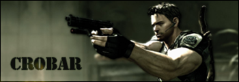
8/10 iLike, shame you didnt enter it in the nightmares themed sotw, it looks very very nightmary

#1923
-
- Gold Member
-
- 4950 posts
Light up life.
Posted 24 July 2008 - 19:16
9.9/10 same again - @ P4v3d - didn't enter it in the nightmares SOTW as I entered it for the horror movies one - Alien and all!
For there can be no death without life.
#1924
-
- Project Team
-
- 1909 posts
veritas vos liberabit
-
Projects: Hangar 13 Projects
Posted 24 July 2008 - 19:28
Ok, its grown on me a bit- 8.5. Definitely a lot of technical work involved.
kinda, sorta alive.
#1925
-
- Project Team
-
- 7683 posts
Eternal Glow
Posted 25 July 2008 - 10:40
Remove the middle soldier and it'll be a 9/10
1 user(s) are reading this topic
0 members, 1 guests, 0 anonymous users

