Jump to content


Wizard's Signatures


236 replies to this topic

#101 Wizard

    [...beep...]

  • Administrator
  • 9627 posts

Posted 16 December 2007 - 22:12

Thanks guys & @ Warbz one sig with no fractals! :P

Posted Image

Edited by Wizard, 16 December 2007 - 22:13.


#102 Sgt. Nuker

    Greenskin Inside

  • Global Moderator
  • 13457 posts
  • Projects: Shoot. Chop. Smash. Stomp.

Posted 16 December 2007 - 22:36

View PostWizard, on 16 Dec 2007, 11:16, said:

Time for an update.

Posted Image

Posted Image


What an update it is. The second would have to be my favorite of the two, simply because you added more than just water/blue effects. Variable sized circles and faded dashed lines. They may not sound like much, but arranged the way you have them, and with the right frequency, they give the sig a bit of pop. Wizard, you've developed your own unique way of developing sigs in just a short time.


My best,

Nuker

P.S. Your Ultraviolet signature looks kind of like a dream scene from a movie. :P
Posted Image

#103 Wizard

    [...beep...]

  • Administrator
  • 9627 posts

Posted 17 December 2007 - 00:02

Cheers Major! Always appreciate the critique!

This one:
Posted Image
Is actually WAY more complicated then you'd realise. It has at least 40 plus layers all coming together to make that sig. I know it doesn't look like it but it is packed with stuff. It's also the first in what I hope will be a new style for me. There are lots of GFX sites out there that I am trawling through and picking bits up. This style is very hard to recreate and takes a lot of time. I hope the next one will be considerably better.

Anyone got any C&C for me?

- W

#104 Alias

    Member Title Goes Here

  • Member
  • 11705 posts

Posted 17 December 2007 - 00:08

The background is real nice... but the pixelation on the render doesn't appeal.

Posted Image

#105 Sgt. Nuker

    Greenskin Inside

  • Global Moderator
  • 13457 posts
  • Projects: Shoot. Chop. Smash. Stomp.

Posted 17 December 2007 - 01:37

I wouldn't swear to it, but I believe the pixelation is intentional.
Posted Image

#106 Wizard

    [...beep...]

  • Administrator
  • 9627 posts

Posted 17 December 2007 - 01:46

You are right Nuker, the pixelation is deliberate, but I also agree with Alias. As I said this is a first attempt at a tough style and is far more "pro" than anything else I have attempted before so there are going to be certain areas I am not 100% on. This sis is very labour intensive and tests your creative & technical metal to the extreme and it's only natural that the first couple will have flaws like the pixelation.

But having said that I have something on the drawing board at this very moment that is considerably better than the above and am looking forward to showing it off soon.

Thanks for you crits guys!

#107 Wizard

    [...beep...]

  • Administrator
  • 9627 posts

Posted 17 December 2007 - 21:20

Well I said that I had something on the go

Posted Image

Again, a progression in this style of work. No where near what I am after but I think more accomplished that the one above. There are some points I have taken on board from some good artists and will make some changes soon enough.

In the mean time what do you think?

#108 Warbz

    IRC is just a multiplayer notepad.

  • Project Team
  • 4646 posts

Posted 17 December 2007 - 21:31

I like it but i think the placement of the head is a bit wierd. It seems like its just floating there.

Posted Image

#109 Lord Atlantis

    I am Iron Man

  • Member
  • 3807 posts

Posted 18 December 2007 - 00:02

That signature is amazing... I love the entirety of it. Outstanding work there. :)

*wants to know how you do it*
Posted Image

#110 Wizard

    [...beep...]

  • Administrator
  • 9627 posts

Posted 18 December 2007 - 08:40

View PostLord Atlantis, on 18 Dec 2007, 0:02, said:

That signature is amazing... I love the entirety of it. Outstanding work there. :D

*wants to know how you do it*

Thanks Atlantis. Well if you have PS, a couple of hours and a hell of a lot of patience.......:) That sig took a very long time to make. There are, as with the previous one, about 40 layers all told, each with some serious effects. I am still building up my style and technique on this type of sig but maybe if I have a few hours to spare I might tut it.

@ Warbz, thanks mate I am working on the placement etc. Abourrar suggested to use a render/stock and include the body. Might give that a go. However if you check about for this sorta style, it's not uncommon.

#111 Cattman2236

    Freelance Photoshop Artist

  • Gold Member
  • 970 posts
  • Projects: Massive Destruction: First Encounter

Posted 18 December 2007 - 15:05

View PostWizard, on 17 Dec 2007, 21:20, said:

Posted Image
In the mean time what do you think?


Awsome work mate, i rather like the blending and the use of brightness/contrast, Keep them coming mate :)
Posted Image
Posted Image

#112 Wizard

    [...beep...]

  • Administrator
  • 9627 posts

Posted 19 December 2007 - 08:14

View PostCattman2236, on 18 Dec 2007, 15:05, said:

Keep them coming mate :)

Well you did say.....:P
Posted Image
My latest

#113 Warbz

    IRC is just a multiplayer notepad.

  • Project Team
  • 4646 posts

Posted 19 December 2007 - 08:36

I like the colours and the fractals but i still dont really like the head that seems to be just randomly dropped in the middle. =/

Posted Image

#114 Wizard

    [...beep...]

  • Administrator
  • 9627 posts

Posted 19 December 2007 - 20:32

All very quiet today. Ah well

Posted Image

#115 Warbz

    IRC is just a multiplayer notepad.

  • Project Team
  • 4646 posts

Posted 20 December 2007 - 14:34

again, i love the use of the the fractals, and i like the color scheme, but im not sure what the guy is actually doin.

Posted Image

#116 Libains

    Light up life.

  • Gold Member
  • 4950 posts

Posted 20 December 2007 - 18:03

Well i think he's just standing there and whatnot. Really nice couple of sigs that you've made here Wizard, i especially like this Posted Image
one, but that's probably 'cos it's the most recent one!

Edited by AJPOD, 20 December 2007 - 18:04.

For there can be no death without life.

#117 Wizard

    [...beep...]

  • Administrator
  • 9627 posts

Posted 20 December 2007 - 22:48

He is just standing there. Sort of like he is on fire. Cheers for the comments guys. I hope that by tomorrow or Saturday I will have a very big update planned for y'all! Keep the CnC coming though guys, what doesn't kill me makes me stronger!

Edited by Wizard, 20 December 2007 - 22:49.


#118 Lord Atlantis

    I am Iron Man

  • Member
  • 3807 posts

Posted 20 December 2007 - 23:47

Are all of the fractals that are used in your siggie generated in PS or do you have a program that allows you to create them?
Posted Image

#119 Wizard

    [...beep...]

  • Administrator
  • 9627 posts

Posted 21 December 2007 - 08:23

I haven't got a clue how to make fractals/c4ds mate. That is something on my "to learn list" for 2008. I nick them all from places like planet render.

#120 Rayburn

    People-Hater

  • Gold Member
  • 4802 posts

Posted 21 December 2007 - 08:49

Nice sigs. The style of these latest ones reminds me of things I've seen on Planetrenders. :P

#121 Wizard

    [...beep...]

  • Administrator
  • 9627 posts

Posted 21 December 2007 - 10:22

Thanks Rayburn. I do inhabit the forums there quite a lot and you tend to pick up the styles. But that is only one of the gfx sites I use, this new style is pretty much a combo of about 3 or 4 sites I visit. Nearly finished with the big update. :P

Edited by Wizard, 21 December 2007 - 13:37.


#122 Wizard

    [...beep...]

  • Administrator
  • 9627 posts

Posted 21 December 2007 - 14:46

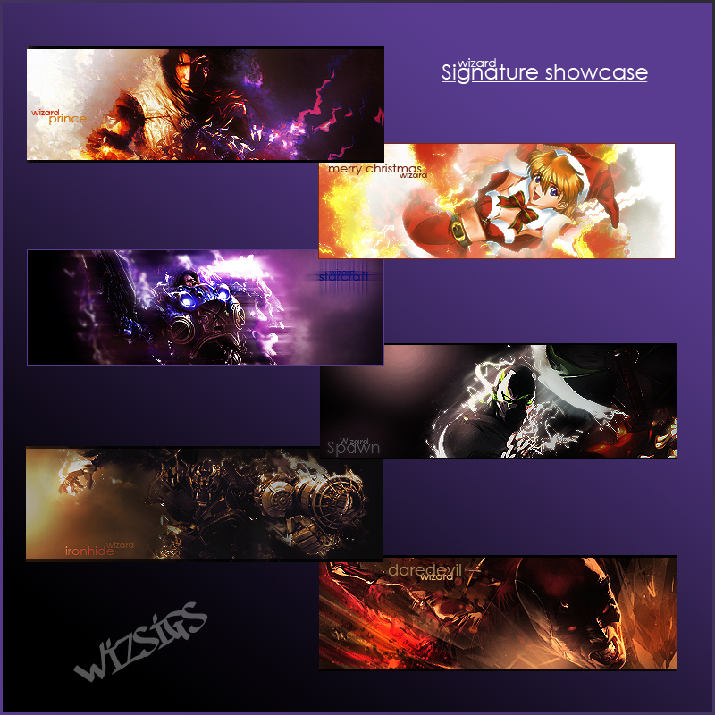
Here is that large update I promised

Posted Image

Edit: old sig taken out and replaced with second SOTW entry.

- W

Edited by Wizard, 21 December 2007 - 14:53.


#123 Alias

    Member Title Goes Here

  • Member
  • 11705 posts

Posted 21 December 2007 - 15:38

The Starcraft, Davedevil and Transformers ones are top class.

No criticisms on them.

-On the Prince of Persia one, the C4D distracts from the render too much.
-Chrismas one is good also, but again a bit of C4D overuse.
-The only thing I can see that's wrong with the Spawn one is it needs something to fill the void at the top left.

Posted Image

#124 Libains

    Light up life.

  • Gold Member
  • 4950 posts

Posted 21 December 2007 - 15:58

I'd say - transformers one is brilliant. Daredevil one is not far behind it either in terms of say, everything. I've never particularly liked starcraft, but that is also great, although it might be interesting to see the writing without the blurred effect - only possible criticism. The Prince one is also good, but i'd reckon that it could be better, but i'm not sure how - there's just something that doesn't quite fit.. I also really like the xmas one - couldn't criticise that at all. And finally, the spawn one i'm not fond of - i'm not sure whether you meant it to be a bit pixelated, but it doesn't come across too well, for me, and as Alias said, you might need to fill the far corner with something other than the little shine.

But great job nonetheless!
For there can be no death without life.

#125 Wizard

    [...beep...]

  • Administrator
  • 9627 posts

Posted 21 December 2007 - 18:30

Thanks for the comments guys. All really appreicated. Everyone helps me get that bit better.

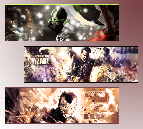
I completely agree that the Spawn sig is pants :P
The Xmas one was done inabout 3 minutes so I am not to unhappy with the way it turned out and really couldn'tbe bothered to tone it down tbh.

As the Spawn sig was crap I have come up with a rework plus a couple of others:

Posted Image

I really like the Dead Rising sig. Think the colours are cool! :P
If anyone wants any of the sigs I make in here then you are more than welcome to them. So long as I haven't got them in my sig right now you can let me know and I can change the nik.

- W


9 user(s) are reading this topic

0 members, 9 guests, 0 anonymous users