Jump to content


Aarons Zone


98 replies to this topic

#1 Zhao

    That pro guy.

  • Project Team
  • 619 posts
  • Projects: Situation Zero

Posted 25 December 2009 - 14:53

Posted Image

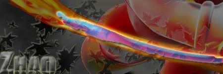
Its my 1st , whatdaya think xD

Edited by Aaron, 07 May 2010 - 22:57.


#2 BeefJeRKy

    Formerly known as Scopejim

  • Gold Member
  • 5114 posts
  • Projects: Life

Posted 25 December 2009 - 14:56

Not bad though it feels overall a little too dark.
Posted Image

#3 Zhao

    That pro guy.

  • Project Team
  • 619 posts
  • Projects: Situation Zero

Posted 25 December 2009 - 15:44

Where can i find more brushes at ?

#4 BeefJeRKy

    Formerly known as Scopejim

  • Gold Member
  • 5114 posts
  • Projects: Life

Posted 25 December 2009 - 15:46

Here would be a good start
Posted Image

#5 Zhao

    That pro guy.

  • Project Team
  • 619 posts
  • Projects: Situation Zero

Posted 25 December 2009 - 21:13

Posted Image

#6 TheDR

    Whispery Wizard

  • Administrator
  • 5852 posts

Posted 25 December 2009 - 21:30

The BG is nice, it's not too over done. The text is a bit too close to the edges and perhaps a bit too big, also, it's a good idea to place each word on a separate layer. However, it's very good for a second sig.

Keep on making them, its always nice to see a new guy start.
Just remember to take inspiration from other peoples sigs but make sure you make a twist to the style, then it feels more personal, interesting and original.

Good luck and keep experimenting!
Posted Image
F O R T H E N S
Posted Image

#7 Zhao

    That pro guy.

  • Project Team
  • 619 posts
  • Projects: Situation Zero

Posted 26 December 2009 - 00:15

Posted Image

Gimme some more ideaa D:!

Edited by Zhao, 26 December 2009 - 00:29.


#8 Nid

    Human Being number 80446219302

  • Project Team
  • 2501 posts

Posted 26 December 2009 - 00:38

Far too big, wrong choice with the motion blur on Luigi, generic outer glow on all the characters, Daisy has a higher resolution than the others making her look out of place, the others all just look too blurry. Your text is tiny as well, it is hard to read, and again, generic outer glow. There is a nasty grey patch behind mario where the background seems to be non-existant, and I don't know what is going on with that border, but it is very inconsistent, and it just looks like you forgot to erase all the white bits of your Luigi picture before you applied the motion blur. While the placement and composition is generally good, you could work on the sizes of your characters.

In short, it just looks a mess.

3/10, a lazy attempt, you can do much better.
Posted Image

#9 Zhao

    That pro guy.

  • Project Team
  • 619 posts
  • Projects: Situation Zero

Posted 26 December 2009 - 00:39

Yeh because everyone does that on there 1st day...

i didnt notice how many errors i made anyways

And its not the fact i was lazy , i didnt know how to fix that border thing so i just continued and tryed to hide it as much as possible .

I spent almost 2 hours on this -.-

Edited by Zhao, 26 December 2009 - 00:42.


#10 Libains

    Light up life.

  • Gold Member
  • 4950 posts

Posted 26 December 2009 - 00:43

View PostZhao, on 26 Dec 2009, 0:15, said:

Posted Image

Gimme some more ideaa D:!

Hardest part of making sigs is getting ideas. And I'd agree with Niddy for the most part ,this seems slapped together in a hurry, the colour for the outer glow is all but the exact default colour, and the motion blur was a bad choice. I'd also question the width of the image - is there a reason it's that wide? If not, then try and force yourself to stick to specific constraints, it will force you to be more sparing with colours and images, and make you focus on the details more. Large images are FAR harder to produce.
For there can be no death without life.

#11 Nid

    Human Being number 80446219302

  • Project Team
  • 2501 posts

Posted 26 December 2009 - 00:44

Tbh, your last work was far superior, you have to set the bar and then achieve it.
You set the bar and then fell very short.
Posted Image

#12 Zhao

    That pro guy.

  • Project Team
  • 619 posts
  • Projects: Situation Zero

Posted 26 December 2009 - 00:46

i was actually trying new tools and experimenting

ill just try to accept it as constructive criticism.

Edited by Zhao, 26 December 2009 - 00:51.


#13 Zhao

    That pro guy.

  • Project Team
  • 619 posts
  • Projects: Situation Zero

Posted 26 December 2009 - 04:41

Next peice of work , tryed new brushes , its kinda Meh
Learning New tools though

Posted Image
Posted Image
Posted Image

Edited by Zhao, 26 December 2009 - 07:47.


#14 TheDR

    Whispery Wizard

  • Administrator
  • 5852 posts

Posted 26 December 2009 - 11:39

I thought I'd start with text as it seems to be a struggling point for a lot of new sig makers (It also gives you time to find your natural style on the art side of things).

Don't place the text in the corners, its rather boring and it never looks very good as it feels like the text isn't part of the main sig.
Try experimenting with different text locations, this can add new focus points or create a whole different tone to the sig.

A good example of text usage is Nem (As you can find here in his thread).

Posted Image

As you can see in his latest work, he has created a whole different feeling to the sig just by putting his name in a different place, rather than just slapping it in one of the corners.

Your text should also be in a nice simple font, rather than anything complex. If you get bored of using Arial or something similar, there is a nice selection of simple fonts on Dafont, which can be found here.
The only time you should use a different, more complex type of font is when it relates to the subject or you are going for something abstract and creative.

A good example of using more complex text in a sig is Pav3d's work (as seen below), he does it very very well, but he uses more complicated photoshop tools to "Frankenstein" text, rather than the text tool itself. It has been proven to give really nice results as you can probably see from his work.

View PostPav3d, on 3 Jul 2009, 21:35, said:

Posted Image
"Mikeman is "built" from copy/pasting/clonetool/etc the classic rayman logo"

Anyway, i hope my introduction to sig text helps out, just remember to keep it simple and make sure it fits with the style of the sig. There is nothing worse than out of place text stealing the focus away from the art.
Posted Image
F O R T H E N S
Posted Image

#15 Warbz

    IRC is just a multiplayer notepad.

  • Project Team
  • 4646 posts

Posted 26 December 2009 - 14:33

Thought I'd add how unappreciative you seem when others try to help you. They are taking the time to study the pieces you are making and give you points upon which to improve, even going out of their way to find good examples for you to take inspiration from. You then respond with snide or sarcastic remarks, for example...

Quote

Yeh because everyone does that on there 1st day...


You asked for a location from which to get brushes and JRK linked a page with a great number of resources from. You didn't even acknowledge his help.

Ever heard the phrase 'don't bite the hand that feeds you'?

Edited by W!, 26 December 2009 - 14:34.


Posted Image

#16 Zhao

    That pro guy.

  • Project Team
  • 619 posts
  • Projects: Situation Zero

Posted 26 December 2009 - 15:19

Posted Image

Quote

I will accept it as constructive criticism @W!


Posted Image

Finding the right spot for text is hard but i think im getting there

Edited by Zhao, 26 December 2009 - 18:29.


#17 ΓΛPTΘΓ

    Ecchi Toaster

  • Project Team
  • 923 posts
  • Projects: Spam

Posted 26 December 2009 - 22:06

Look pretty good, much better but all your sig seems washed out to me.
Posted Image
Posted Image

Awesome radio

Quote

19:44 - Chyros: I'm very harmless

#18 Zhao

    That pro guy.

  • Project Team
  • 619 posts
  • Projects: Situation Zero

Posted 26 December 2009 - 22:23

Posted Image

im practicing the lighting tool and stuff

perhaps to light in the corner , didn't know how to fix that unfortunately


Posted Image

MARIO!

Edited by Zhao, 26 December 2009 - 23:30.


#19 Libains

    Light up life.

  • Gold Member
  • 4950 posts

Posted 27 December 2009 - 10:23

Apply the lighting tool to a separate layer, then fiddle with the opacity and that should give you more control over the level of light in the image. Regards the text, you're really not going anywhere fast with the text in that it's still not placed particularly well, and on the blue one, is nigh-on invisible. I'd suggest you stop playing with fancy fonts that maybe suit the render in the sig, but don't suit the sig. Furthermore, try and stop using so many of the tool in the layer options section, it's obvious that you;ve used these, and a good text layer won't need them unless it is the only thing showing - you can for example set the fill of a layer to 0, apply an option like outer glow, and it will just display the outer glow, which can be quite effective - the same can be done with emboss and shadow if you're looking for a different way to use text. just try and stick to stuff like Arial and Times New Roman for now - the simplest fonts are so often more effective.
For there can be no death without life.

#20 ΓΛPTΘΓ

    Ecchi Toaster

  • Project Team
  • 923 posts
  • Projects: Spam

Posted 27 December 2009 - 10:46

I agree with AJ, start with standard font (I like Trebuchet MS) as try to blend it in first and get the hang of it. Fancy fonts may look nice, but much harder to blend and sometimes just straight unsuitable for the overall sig.
Posted Image
Posted Image

Awesome radio

Quote

19:44 - Chyros: I'm very harmless

#21 Pav:3d

    YOUR WORLDS WILL BECOME OUR LABORATORIES

  • Project Leader
  • 7224 posts
  • Projects: EC, CORE, ER

Posted 27 December 2009 - 12:18

Quit using the default outer glow colour, it looks horrible on your sigs. Text in the sig should imo blend seamlessly with the sig, not be slapped on. Try using a mario style font or make the font out of mario blocks or something.
Try a different background, one thing I cant stand in sigs is a random background completely unrelated to the render except for its colour.

Posted Image

Posted Image

#22 Zhao

    That pro guy.

  • Project Team
  • 619 posts
  • Projects: Situation Zero

Posted 27 December 2009 - 12:29

The font is called Mariofont2... but i get your point

ill stick to the "Simple ones" now.

as to the background , what kind? Like bricks or something that relate to mario in general or just a black background like you got there

Edited by Zhao, 27 December 2009 - 12:37.


#23 Zhao

    That pro guy.

  • Project Team
  • 619 posts
  • Projects: Situation Zero

Posted 27 December 2009 - 15:33

Something like this ?!

Posted Image

#24 Pav:3d

    YOUR WORLDS WILL BECOME OUR LABORATORIES

  • Project Leader
  • 7224 posts
  • Projects: EC, CORE, ER

Posted 27 December 2009 - 16:17

Def an improvement :o

Posted Image

Posted Image

#25 Zhao

    That pro guy.

  • Project Team
  • 619 posts
  • Projects: Situation Zero

Posted 27 December 2009 - 16:52

I hope i can keep it that way

<Next sig here " ">


12 user(s) are reading this topic

0 members, 12 guests, 0 anonymous users